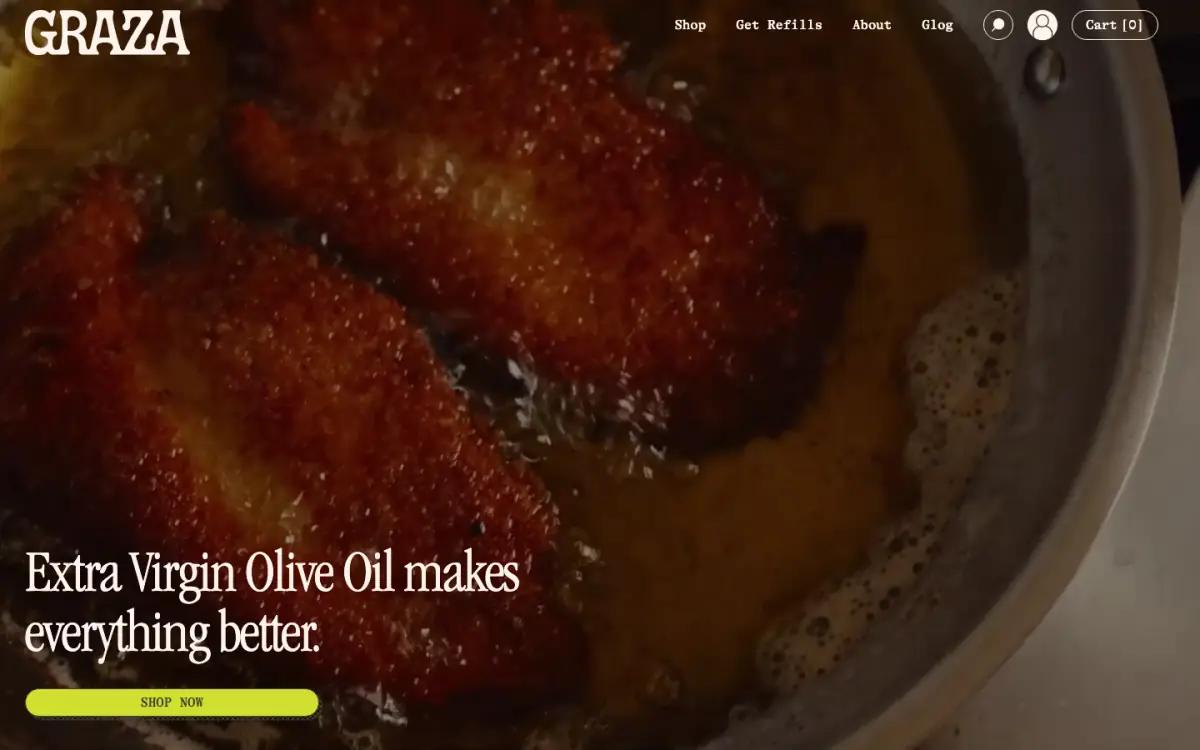
Food, not bottles, above the fold
A full-bleed shot of something frying in oil, one line of copy and a chartreuse pill button.
Read the Graza landing page teardownA hero section is the first screen of a landing page: the headline, image and main button a visitor sees before scrolling. The strongest ecommerce heroes here say what the product does in under ten words, show it in use, and offer one or two clear buttons.
By The Teardown Desk · Updated Nov 19, 2026
Each crop below is the first screen of a real homepage, captured at 1440 pixels wide in November 2026.
Click any hero to read the full teardown of that page.
A full-bleed shot of something frying in oil, one line of copy and a chartreuse pill button.
Read the Graza landing page teardown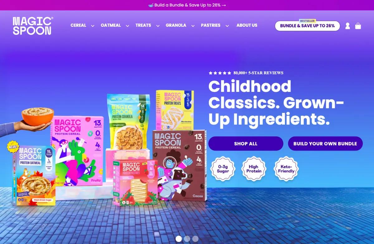
"Childhood Classics. Grown-Up Ingredients." with a rating line, two buttons and three round claim badges.
Read the Magic Spoon landing page teardown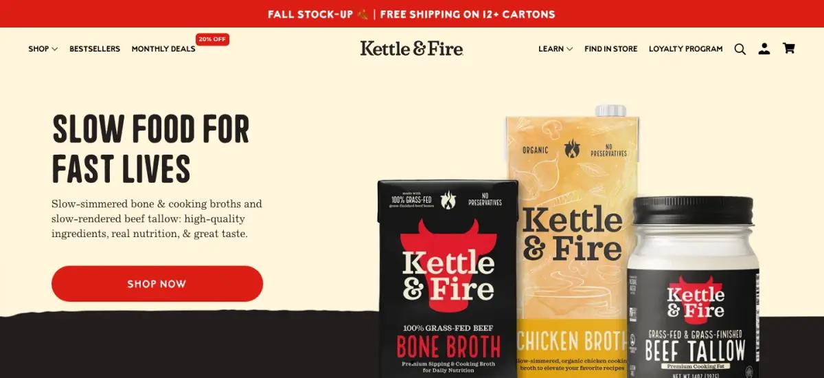
"Slow Food For Fast Lives" beside three hero products: beef bone broth, chicken broth and beef tallow.
Read the Kettle & Fire landing page teardown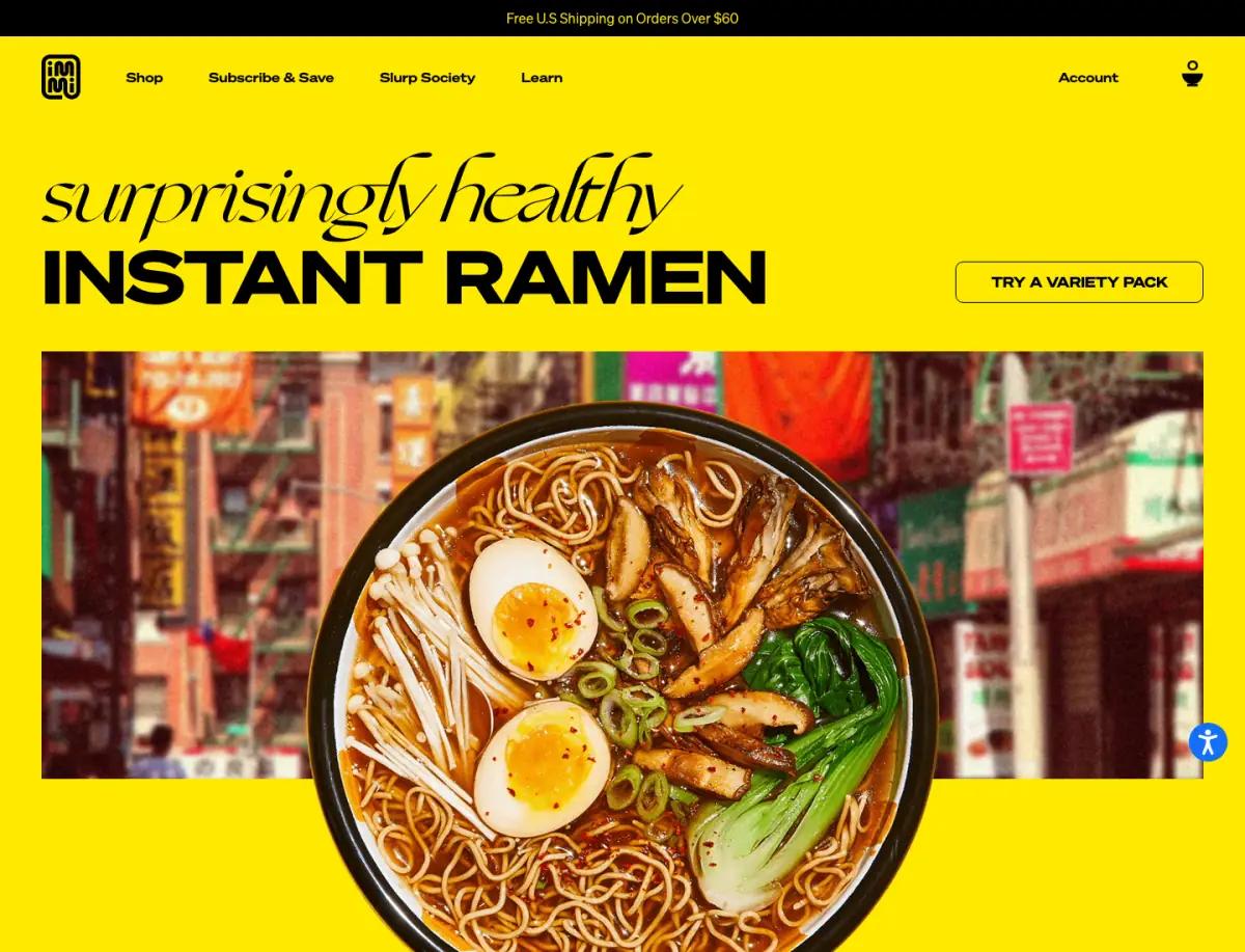
"surprisingly healthy INSTANT RAMEN" over a bowl photo that overlaps a street-scene strip.
Read the immi landing page teardown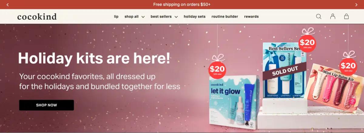
"Holiday kits are here!" over a rose backdrop, with $20 gift tags hanging off each kit.
Read the cocokind landing page teardown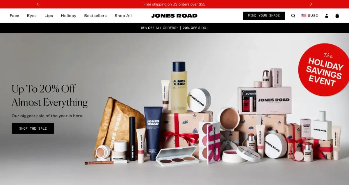
"Up To 20% Off Almost Everything" beside a styled pile of products and gift boxes, with a red sticker.
Read the Jones Road landing page teardownEvery gallery pulls from the same six pages, so you can follow one brand across them.
It is the first full-width section a visitor sees, usually a headline, a short supporting line, an image or video, and a main button. It decides whether people keep scrolling.
Rotating slides can dilute the message. Magic Spoon and Jones Road both use carousels, but their slides repeat one idea in different words, which keeps the message steady.
Most heroes in this gallery use four to seven words. Kettle & Fire's "Slow Food For Fast Lives" is four words and still explains the product's promise.