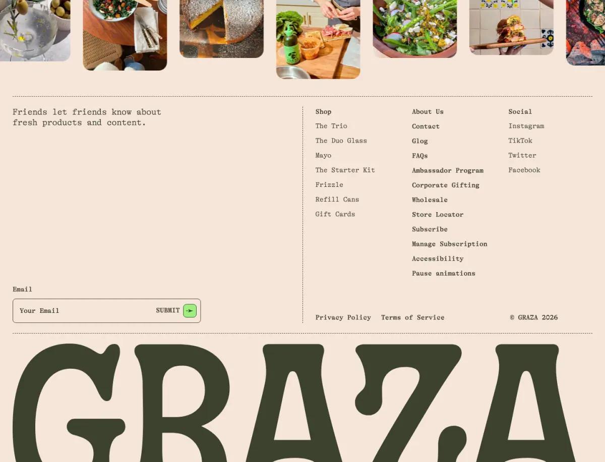
A photo row and a wordmark as wide as the page
A rounded-photo social row, a typewriter sign-up and a wordmark that fills the footer.
Read the Graza landing page teardownA good ecommerce footer gives the page a clear end, offers one email sign-up with a reason to join, and groups links into a few short columns. The footers here range from Graza's page-wide wordmark to immi's strict yellow-on-black grid.
By The Teardown Desk · Updated Nov 19, 2026
Footers get little attention, yet every visitor who scrolls to the end sees one. These crops show six different takes.
Each crop links to the full teardown of that page.
A rounded-photo social row, a typewriter sign-up and a wordmark that fills the footer.
Read the Graza landing page teardown
A short black footer with the wordmark, a compact link list and "Don't miss the magic" email capture.
Read the Magic Spoon landing page teardown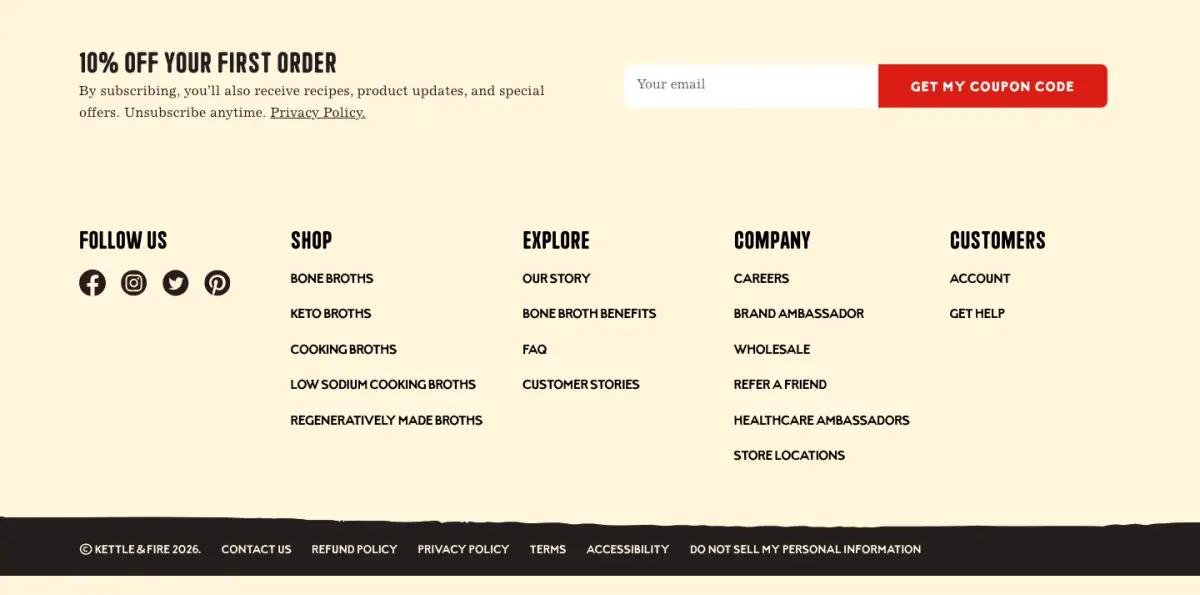
"10% off your first order" email capture and five footer columns on cream.
Read the Kettle & Fire landing page teardown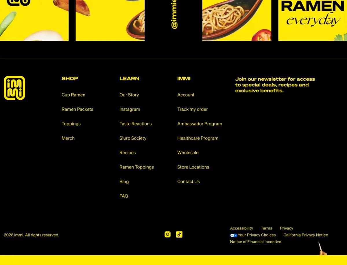
An @immieats image strip and a black footer with yellow link columns and a newsletter pitch.
Read the immi landing page teardown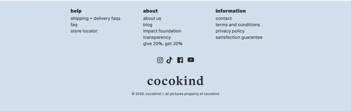
Help, about and information columns, social icons and the lowercase wordmark, on pale blue.
Read the cocokind landing page teardown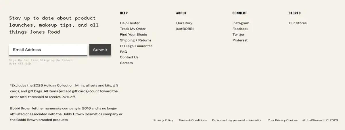
A sign-up line set in a wide mono face, four link columns and the sale's fine print.
Read the Jones Road landing page teardownEvery gallery pulls from the same six pages, so you can follow one brand across them.
An email sign-up, links to help, shipping and returns, company pages and social profiles, plus legal links. Sale terms and disclaimers belong here too.
Many do. Kettle & Fire offers 10% off a first order. Others, like Graza, use a plain invitation instead.
It marks the end of the page clearly and repeats the brand one last time. Graza and cocokind both end on a large wordmark.