immi landing page example: a ramen homepage that argues with a table
The immi landing page puts three nutrition numbers right under the hero. Further down, it compares itself row by row with Cup Noodles, Maruchan and Nongshim. Quotes, flavors and recipes support that argument. It is a strong model for a challenger brand in a category everyone already knows.
By The Teardown Desk · Updated · 4 min read
Everyone knows what instant ramen is. So a challenger's homepage has a narrow job: show what is different in a number or two, then make the bowl look good.
immi's homepage does both, in two colors. At 1440 pixels wide it runs about 9,600 pixels, the longest page in this batch.
It stays easy to read because the system is strict: yellow and black, one wide sans-serif for headlines, and big photos of bowls.

What is on the immi landing page?
The page breaks into 10 sections. Each row links to its note below, and the numbers match the pins on the full-page screenshot.
| # | Section | What it does |
|---|---|---|
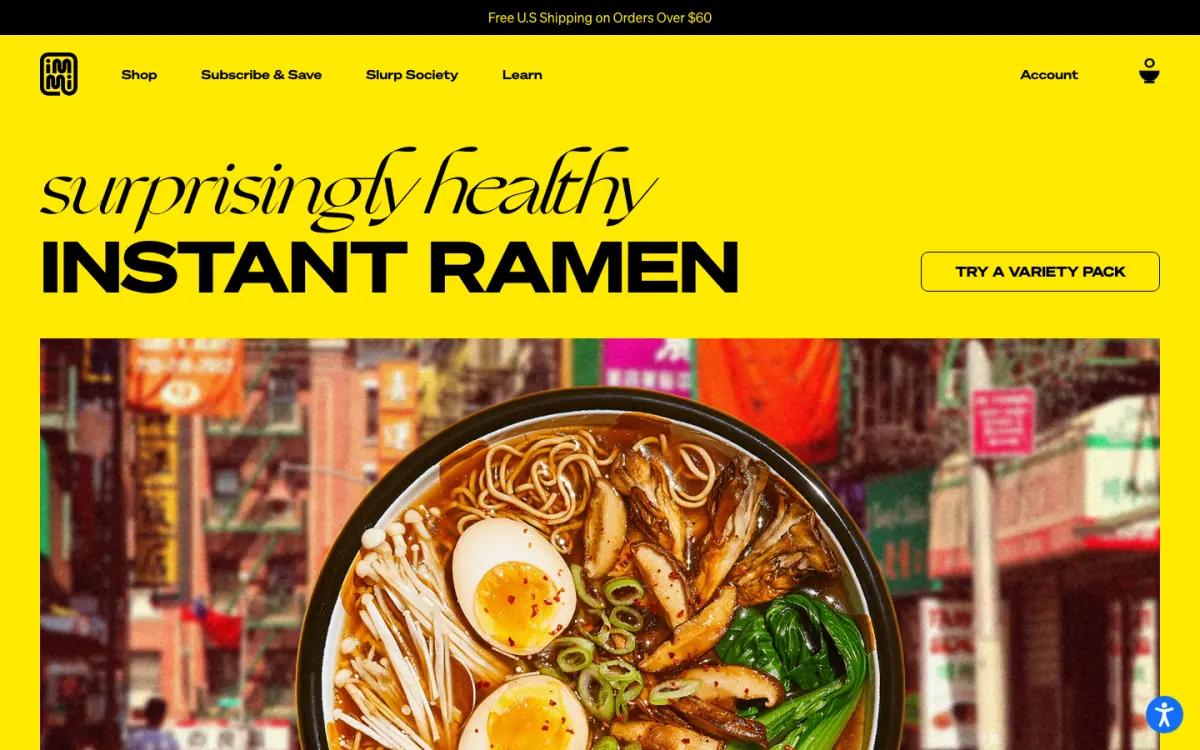
| 1 | Hero | "surprisingly healthy INSTANT RAMEN" over a bowl photo that overlaps a street-scene strip. |
| 2 | Stats | High protein 28g, high fiber 12g, plant-based 100%, split by thin rules. |
| 3 | Story | "A new take on noodles" beside cut-out photos of a spoon of noodles, a chili, fried tofu and a bowl. |
| 4 | Social proof | Round portraits and quotes from people including Naomi Osaka, credited as an immi investor. |
| 5 | Flavors | On black, one bowl at a time with a flavor name, tasting notes and a 'Slurp now' button. |
| 6 | Offer | "Don't like picking favorites?" with three packet shots and a variety pack button. |
| 7 | Comparison | immi against Cup Noodles, Maruchan and Nongshim on net carbs, protein, fiber and plant-based. |
| 8 | Press | Three short press quotes credited with Food Network, Sunset and Fast Company logos. |
| 9 | Recipes | A 'Ramen for everybody' ticker, a large lifestyle photo, and three recipe cards under 'Some assembly encouraged'. |
| 10 | Footer | An @immieats image strip and a black footer with yellow link columns and a newsletter pitch. |
How does the immi landing page work, section by section?
1Two type styles and a bowl that breaks the frame
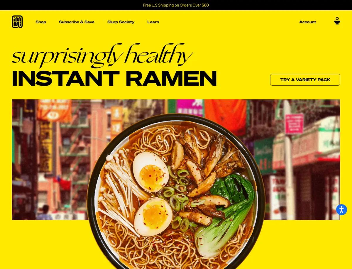
The headline is a pairing. "surprisingly healthy" is set in a light italic script; "INSTANT RAMEN" follows in heavy, wide capitals. The tone shift is the message.
An outlined "Try a variety pack" button sits to the right. Below, a bowl of ramen shot from above overlaps a strip of city street.
Letting the bowl break out of the photo strip is a simple trick. It makes the food feel physical.
2Three numbers right under the fold

Three numbers sit under the hero, split by thin rules: High Protein 28g, High Fiber 12g, Plant-Based 100%. No icons, no paragraph.
For a product whose pitch is nutrition, this is the cleanest summary possible. It arrives before any brand story.
3The brand story with floating ingredients
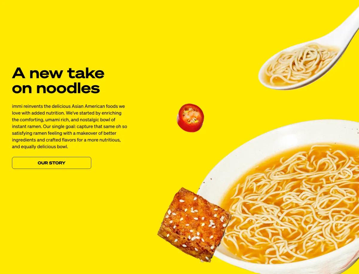
"A new take on noodles" explains the mission in one paragraph: better versions of Asian American comfort foods, starting with instant ramen.
Cut-out photos float on the right: a spoon of noodles, a chili slice, fried tofu and a large bowl. A small note says the toppings are suggestions and points to recipes.
That note is a careful detail. The photo shows more than the packet contains, and the page says so.
4Investor and creator quotes in a carousel
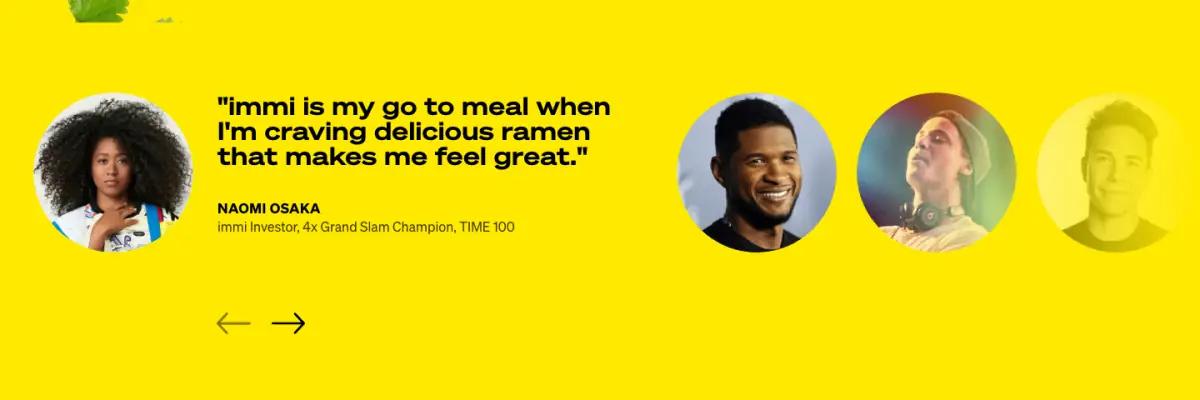
A carousel of round portraits leads with Naomi Osaka, credited as an immi investor and four-time Grand Slam champion. Usher, also credited as an investor, appears too, alongside athletes, a chef and a dietitian.
The page labels investors as investors. That keeps the quotes credible and avoids the look of a paid endorsement.
5Flavors as a dark carousel of bowls
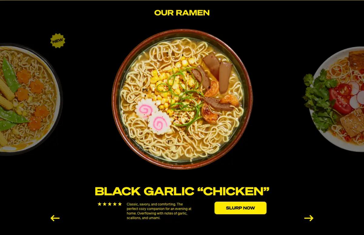
"Our ramen" switches to black. One bowl sits in the center, with neighbors cropped at the edges, so you can tell it is a carousel without arrows.
Under the bowl: the flavor name in yellow capitals, a star row, a line of tasting notes and a "Slurp now" button. The first flavor at capture time was Black Garlic "Chicken."
Tasting notes written like a menu keep a nutrition brand from reading like a supplement.
6A variety pack for the undecided
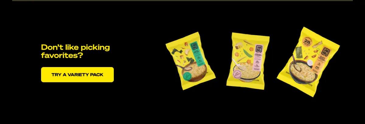
Right after the flavors, a short band asks "Don't like picking favorites?" It offers a variety pack, shown as three tilted packets.
It catches the visitor who just scrolled five flavors and could not choose. The placement is exactly right.
7A nutrition table that names names
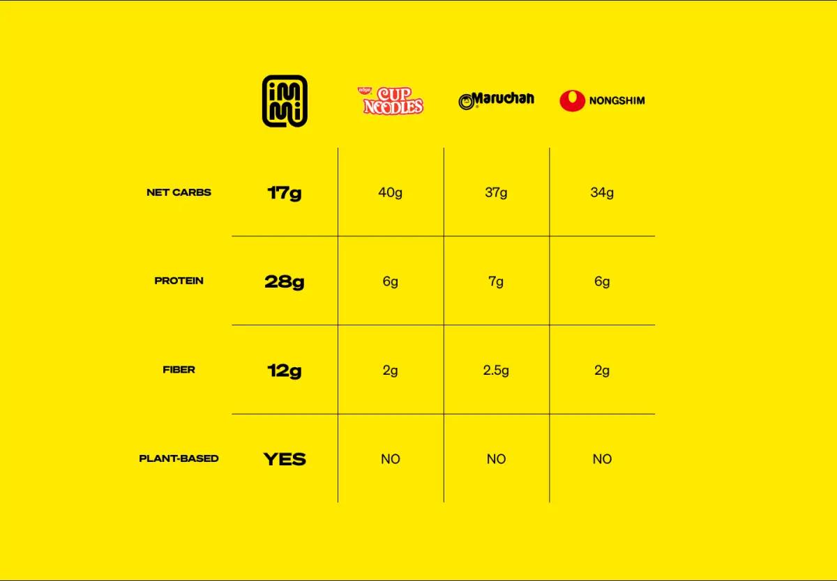
This section makes the page. A table compares immi with three famous brands, using their logos as column headers. The figures, per pack, as shown:
| immi | Cup Noodles | Maruchan | Nongshim | |
|---|---|---|---|---|
| Net carbs | 17g | 40g | 37g | 34g |
| Protein | 28g | 6g | 7g | 6g |
| Fiber | 12g | 2g | 2.5g | 2g |
| Plant-based | Yes | No | No | No |
Most comparison tables hide rivals behind "Brand A" and "Brand B." Naming them is braver and more persuasive, because readers already know those products. It is the boldest move in our food and drink landing page examples.
8Press quotes with logos as credit
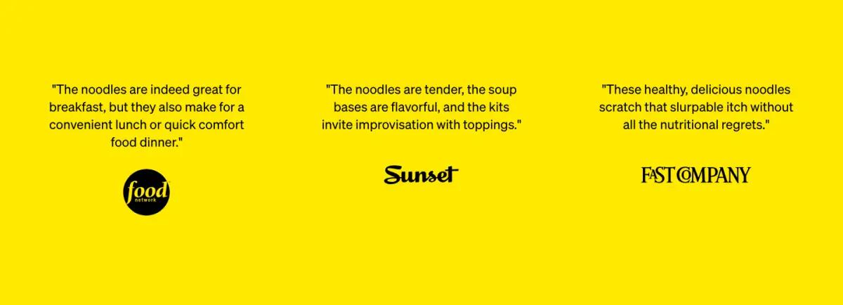
Next come three press quotes over the logos of Food Network, Sunset and Fast Company. The quotes are specific, about tender noodles and flavorful soup bases, which beats a bare logo bar.
9A lifestyle break, then recipes
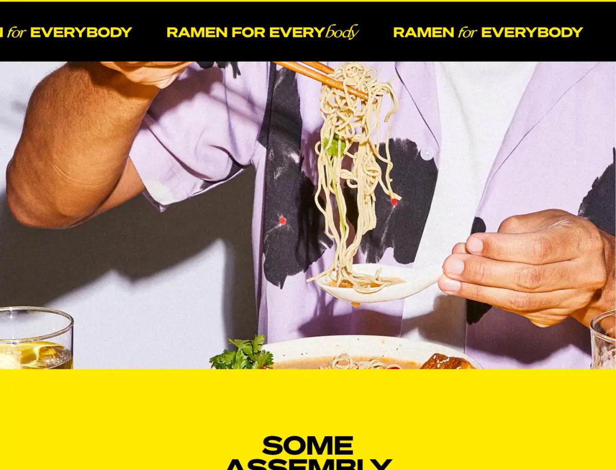
A black ticker reading "Ramen for everybody" leads into a wide photo of someone lifting noodles with chopsticks.
Then comes "Some assembly encouraged," again pairing wide capitals with the italic script. Three recipe cards sit below: immi Jajangmyeon, Creamed Corn Ramen and Spiciest Ramen.
That headline is the best copy on the page. It turns the earlier toppings caveat into an invitation.
10A social strip and a yellow-on-black footer
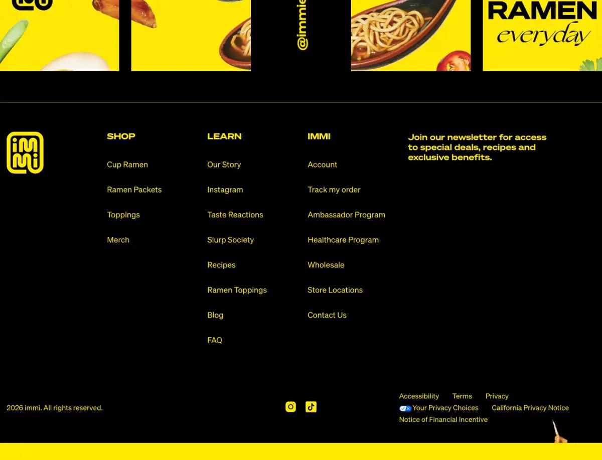
A strip of square brand graphics and the @immieats handle closes the content. The footer is black with yellow headings and a newsletter pitch.
It keeps the page's two-color rule to the very last pixel.
What would we change on the immi landing page?
The comparison table is the strongest argument on the page, and it sits about 4,700 pixels down. A short version, just protein and net carbs, beside the hero stats would reach people who never scroll that far.
Around the lifestyle photo there is a long stretch with little to do. On a phone that becomes several screens between the press quotes and the recipes.
How does the immi landing page look on a phone?
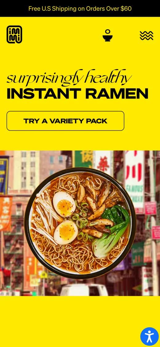
On a phone the logo, cart and menu share a tight top bar. The two-style headline stacks above an outlined button, and the bowl photo fills the width below.
Captured at 390 × 844, first screen
Which fonts and colors does immi use?
We read these from the live page's styles on the capture date. Hex values are the most-used background and text colors.
Typefaces
Palette
- Ramen yellow#FFE900
- Black#000000
- Charcoal#1A1A1A
- White#FFFFFF
How would you rebuild a layout like this?
The comparison table is the piece most worth copying, and the easiest to get wrong. Build it as a real HTML table with logos as column headers, so it reads well on a phone and can be found in search. Keep the hero bowl and the street photo as two layers, so either can change.
Any modern page tool can produce this structure. On Shopify, theme sections cover the basics. Builders such as Replo, Shogun or PageFly add finer layout control, and teams with developers often build it in Next.js.
Whatever the tool, make each band a reusable section with editable text. Then a new promotion is a copy change, not a redesign.
immi landing page FAQ
Which brands does immi compare itself to?
Cup Noodles, Maruchan and Nongshim. The table compares net carbs, protein, fiber and whether each product is plant-based, per pack.
Who is quoted on the immi homepage?
Investors and creators. Naomi Osaka and Usher are both credited as immi investors. Athletes, a private chef and a dietitian also appear.
What fonts does the immi website use?
At capture time, the immi homepage used Söhne Breit (wide display headlines and labels), Söhne (body copy). We read these from the live page's styles.
How long is the immi landing page?
About 9,600 pixels tall at 1440 pixels wide, or roughly 11 desktop screens. We split it into 10 sections.