Magic Spoon landing page example: a subscription page in cartoon colors
The Magic Spoon landing page points nearly every section at one offer: build a bundle and save up to 26%. The hero handles nostalgia, the next band spells out the subscription terms, and the rest of the page stacks reviews. It is a clear model for subscription food brands.
By The Teardown Desk · Updated · 4 min read
High-protein cereal has to win two arguments. It must taste like the cereal you grew up with, and it must be worth paying more for.
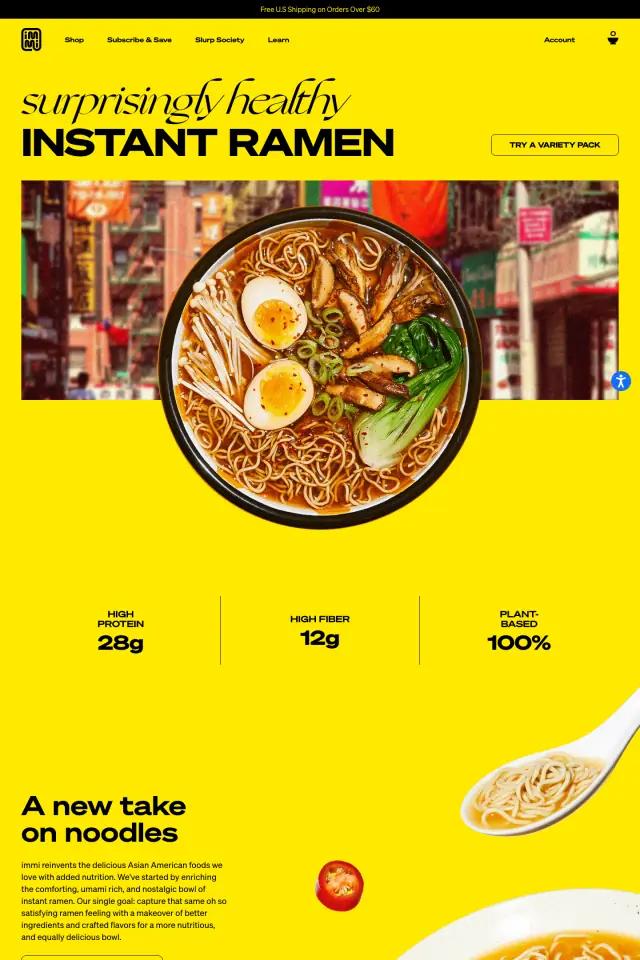
Magic Spoon's homepage splits those jobs. The colors and drawings handle the first. The copy is almost all about the second. Its flavor rail is close kin to the immi landing page flavor carousel.
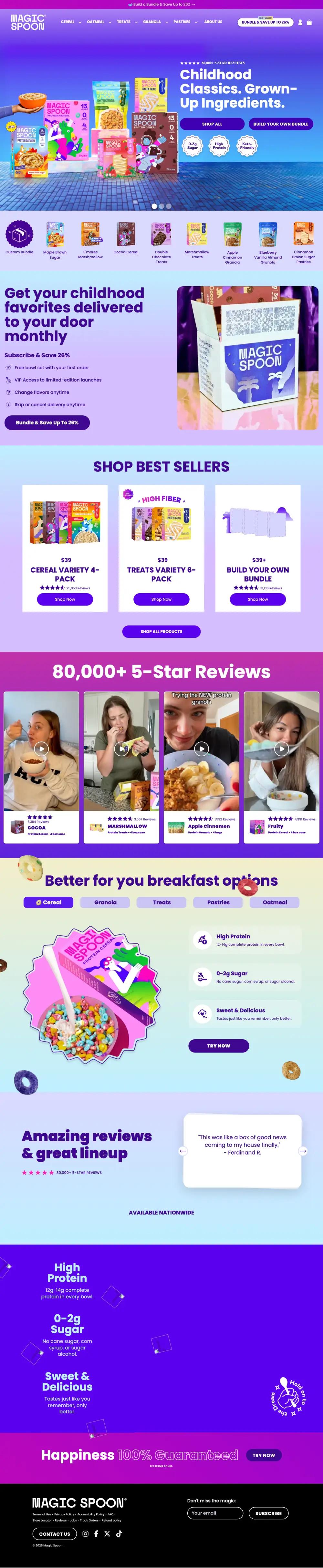
The page runs about 7,000 pixels at desktop width. The palette never leaves violet, lavender and magenta, so the page feels like one box, not a stack of sections.
What is on the Magic Spoon landing page?
The page breaks into 9 sections. Each row links to its note below, and the numbers match the pins on the full-page screenshot.
| # | Section | What it does |
|---|---|---|
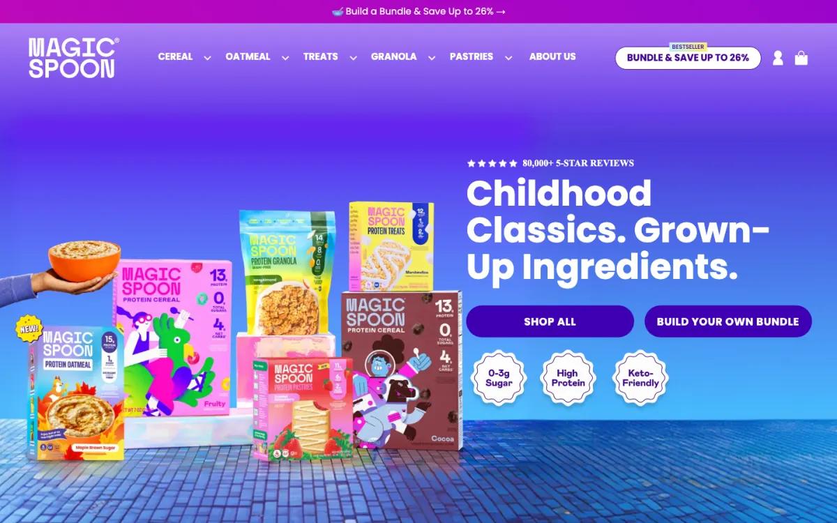
| 1 | Hero | "Childhood Classics. Grown-Up Ingredients." with a rating line, two buttons and three round claim badges. |
| 2 | Flavor rail | A row of single flavors, starting with a custom bundle, sits right under the hero. |
| 3 | Offer | "Subscribe & Save 26%" with four plain benefits, including skip or cancel anytime. |
| 4 | Best sellers | Best sellers are variety packs and a build-your-own option, each with a review count. |
| 5 | Social proof | "80,000+ 5-Star Reviews" over a row of customer videos, each tagged with the product and its rating. |
| 6 | Benefits | Tabs for cereal, granola, treats, pastries and oatmeal, each with protein, sugar and taste claims. |
| 7 | Reviews | "Amazing reviews & great lineup" with one rotating quote card and an 'available nationwide' line. |
| 8 | Guarantee | A violet band repeats the three claims, then "Happiness 100% Guaranteed" and a Try now button. |
| 9 | Footer | A short black footer with the wordmark, a compact link list and "Don't miss the magic" email capture. |
How does the Magic Spoon landing page work, section by section?
1A nostalgia headline, two buttons, three badges
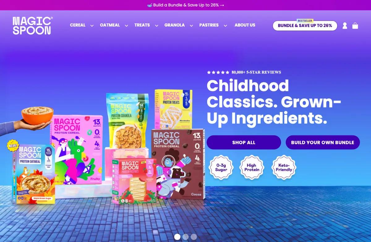
The first slide reads "Childhood Classics. Grown-Up Ingredients." A five-star row above it says "80,000+ 5-star reviews."
Below sit two buttons, "Shop all" and "Build your own bundle," plus three scalloped badges: 0-3g Sugar, High Protein, Keto-Friendly.
Everything a skeptic needs is in one frame: promise, proof, claims and two ways in. The second button matters most. It previews the bundle offer the whole page is built around.
2A flavor rail instead of a category grid

Under the hero is a row of boxes with flavor names, from Maple Brown Sugar to Cinnamon Brown Sugar Pastries. It is a shortcut for regulars and a menu for new visitors.
"Custom Bundle" comes first, styled as a badge. Even the flavor menu keeps the bundle in view.
3Subscription terms before any product card
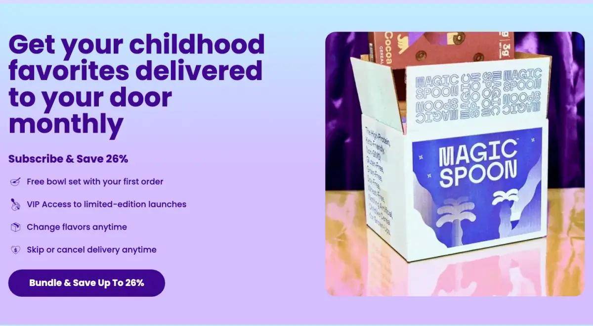
"Get your childhood favorites delivered to your door monthly" leads into "Subscribe & Save 26%." Four short lines follow:
- Free bowl set with your first order
- VIP access to limited-edition launches
- Change flavors anytime
- Skip or cancel delivery anytime
Most subscription pages hide the cancel terms. Here they close the most visible offer on the page. For a product people try out of curiosity, that line likely removes more friction than the discount.
4Three best sellers, all bundles
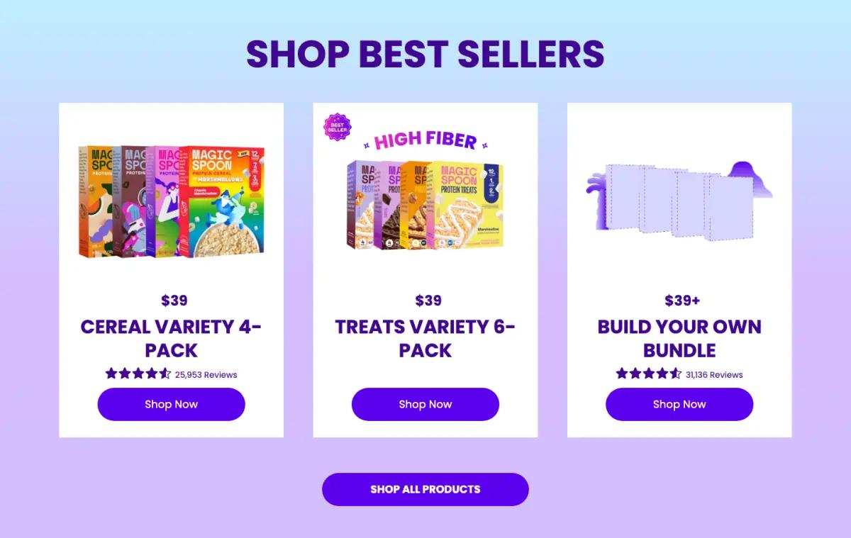
"Shop Best Sellers" then shows three cards: Cereal Variety 4-Pack ($39), Treats Variety 6-Pack ($39) and Build Your Own Bundle ($39+). Two show a 4.6 star rating with tens of thousands of reviews.
No single box is for sale here. Every option is a multi-pack, so the first order starts as a bundle. See more subscription and bundle offer sections.
5Video reviews with the product attached
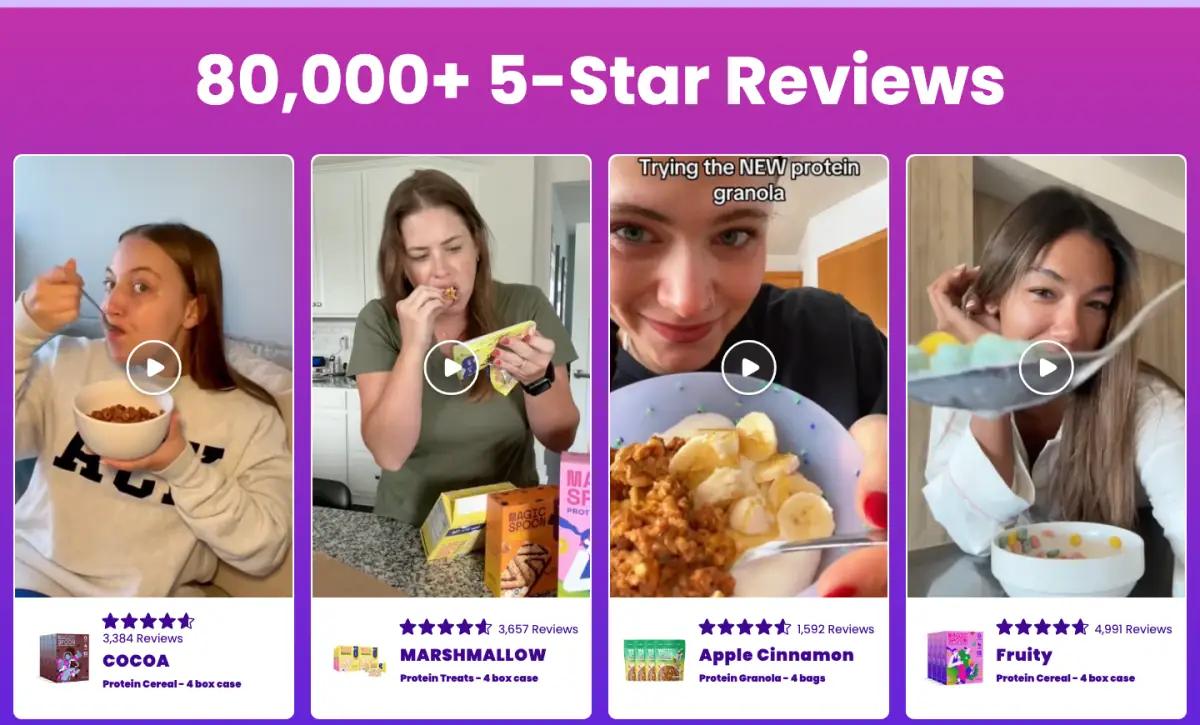
A magenta band with "80,000+ 5-Star Reviews" introduces four vertical videos of people eating the product. Under each video is a product card with a name, rating and review count.
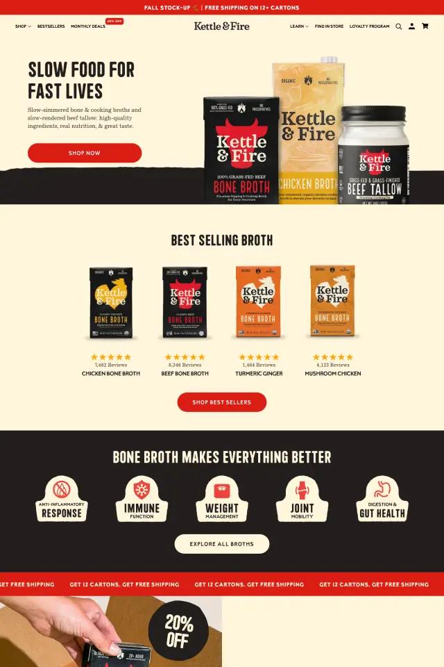
Attaching the product to the testimonial is the detail to copy. It turns a vibe into a path to buy. Kettle & Fire does the same with creator clips.
6Tabs by format, same three claims
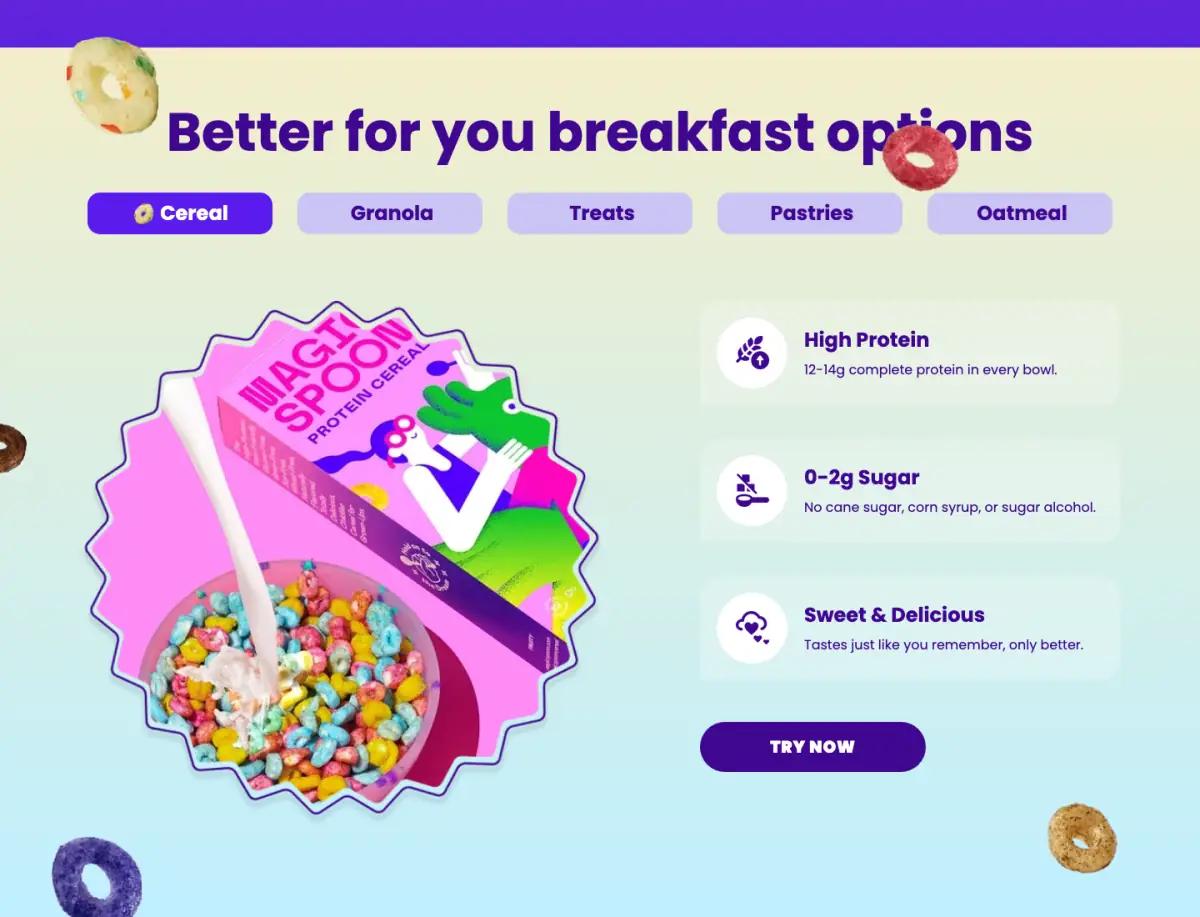
"Better for you breakfast options" uses tabs: Cereal, Granola, Treats, Pastries, Oatmeal. The cereal tab shows a box in a starburst beside three cards.
The cards claim 12-14g of complete protein per bowl, 0-2g sugar with no cane sugar or corn syrup, and a taste "just like you remember." It is the clearest product education on the page, and the second time these claims appear.
7A single quote carousel
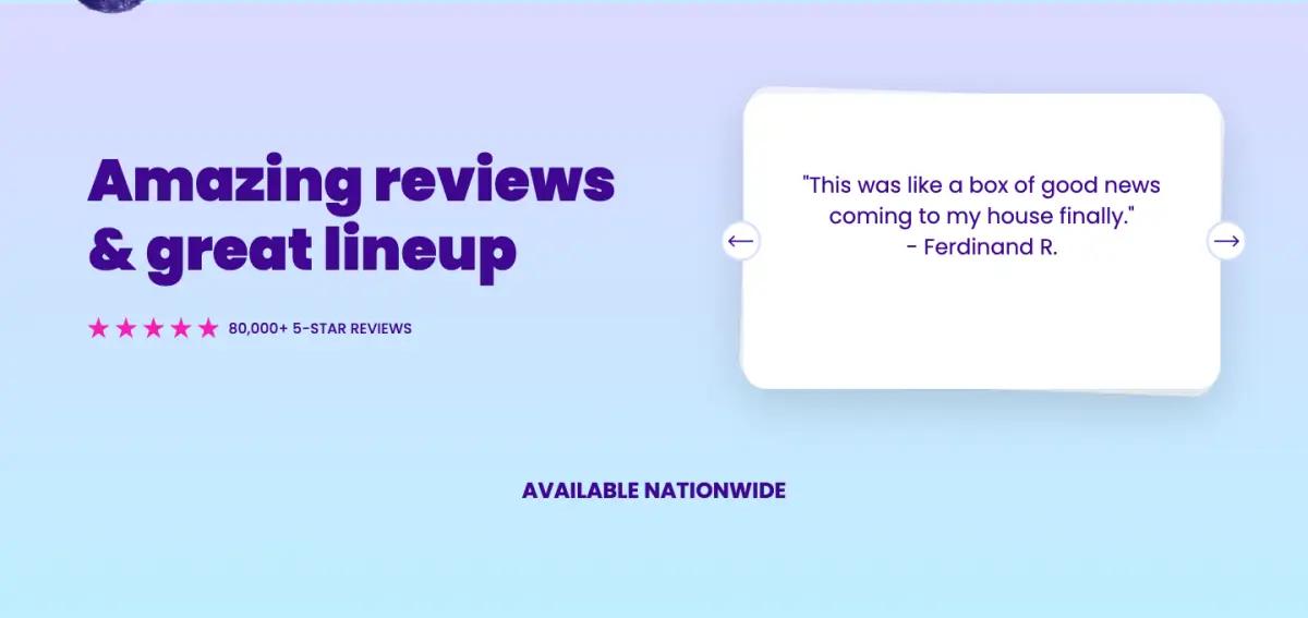
"Amazing reviews & great lineup" pairs a star row with a rotating quote card. The first quote: "This was like a box of good news coming to my house finally."
It is a good line. But after the video section, a second testimonial block adds less than it costs in scrolling.
8Claims again, then a guarantee
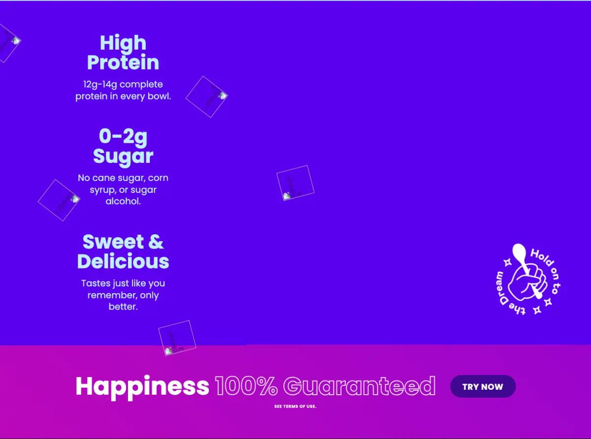
A deep violet band repeats the three claims in large type. Then a magenta strip: "Happiness 100% Guaranteed," a "Try now" button and a link to terms.
A guarantee is the right last word for a subscription page. It answers the final doubt before the footer.
9A black footer with one form
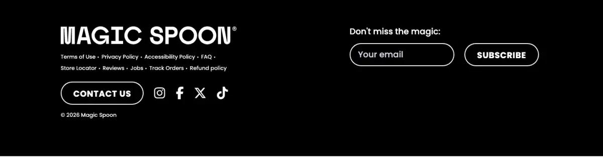
The footer is short: wordmark, one run of small links, a contact button, social icons and an email field. Switching to black after so much purple gives the page a definite end.
What would we change on the Magic Spoon landing page?
The same three claims appear three times: hero badges, tabs and the violet band. One full treatment plus the badges would be enough.
Two review sections sit about 1,500 pixels apart. Folding the quote card into the video section would shorten the page and lose no proof.
How does the Magic Spoon landing page look on a phone?
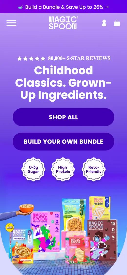
On a phone the hero reorders. The rating, headline, two full-width buttons and badges come first. The product photo drops below in a rounded frame.
Captured at 390 × 844, first screen
Which fonts and colors does Magic Spoon use?
We read these from the live page's styles on the capture date. Hex values are the most-used background and text colors.
Typefaces
Palette
- Electric violet#5B00ED
- Deep purple#3F0791
- Lavender#DAD9FF
- White#FFFFFF
- Black#000000
Magic Spoon landing page FAQ
What offer does the Magic Spoon homepage lead with?
Bundles and subscription. The hero links to a build-your-own bundle. The next band offers Subscribe & Save 26%, a free bowl set with the first order, and skip or cancel anytime.
How does Magic Spoon use reviews on its homepage?
Four ways: a review count in the hero, star ratings on product cards, customer videos tagged with products, and a rotating quote card.
What fonts does the Magic Spoon website use?
At capture time, the Magic Spoon homepage used Poppins (headlines, body and buttons), Mabry Pro (small labels). We read these from the live page's styles.
How long is the Magic Spoon landing page?
About 7,000 pixels tall at 1440 pixels wide, or roughly 8 desktop screens. We split it into 9 sections.