Kettle & Fire landing page example: a bone broth homepage that sells the habit
The Kettle & Fire landing page is built around repeat purchase. Best sellers appear in the second screen. Free shipping on 12 cartons, subscribe and save, and bundle and save each get their own band. It is a useful model for any consumable product that people buy again and again.
By The Teardown Desk · Updated · 5 min read
Bone broth is a habit product. One carton changes nothing; a pantry shelf of them does.
Kettle & Fire's homepage reads as if it was written with that in mind. Almost every band shows the range, explains why to drink broth daily, or gives a reason to buy in volume.
The page runs about 7,100 pixels at desktop width. It switches between cream and near-black. Dark bands carry the brand argument; cream bands carry products.
What is on the Kettle & Fire landing page?
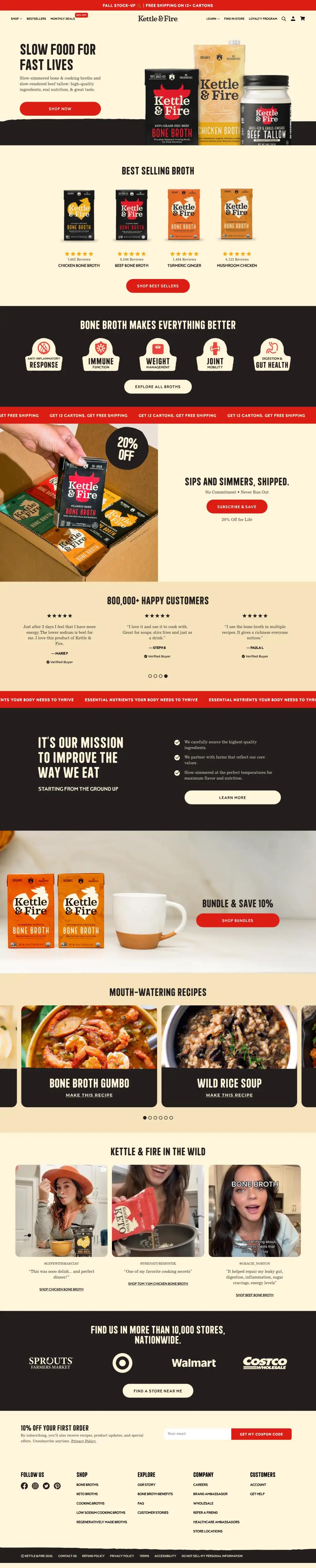
The page breaks into 11 sections. Each row links to its note below, and the numbers match the pins on the full-page screenshot.
| # | Section | What it does |
|---|---|---|
| 1 | Hero | "Slow Food For Fast Lives" beside three hero products: beef bone broth, chicken broth and beef tallow. |
| 2 | Best sellers | Four cartons with star ratings and review counts, from chicken bone broth to mushroom chicken. |
| 3 | Benefits | A dark band of five shield-shaped icons, then a red ticker about free shipping on 12 cartons. |
| 4 | Offer | "Sips and simmers, shipped." with "No commitment, never run out" and 20% off for life. |
| 5 | Social proof | "800,000+ Happy Customers" over a carousel of short reviews marked Verified Buyer. |
| 6 | Mission | "It's our mission to improve the way we eat" with three checked lines about sourcing and simmering. |
| 7 | Bundle | "Bundle & Save 10%" over a still life of two cartons and a mug. |
| 8 | Recipes | A carousel of recipe photos with condensed titles, such as Bone Broth Gumbo and Wild Rice Soup. |
| 9 | Creators | Three creator clips with handles and quotes, each linking to the exact broth in the video. |
| 10 | Retail | "Find us in more than 10,000 stores, nationwide" over Sprouts, Target, Walmart and Costco logos. |
| 11 | Footer | "10% off your first order" email capture and five footer columns on cream. |
How does the Kettle & Fire landing page work, section by section?
1A slogan and the whole shelf
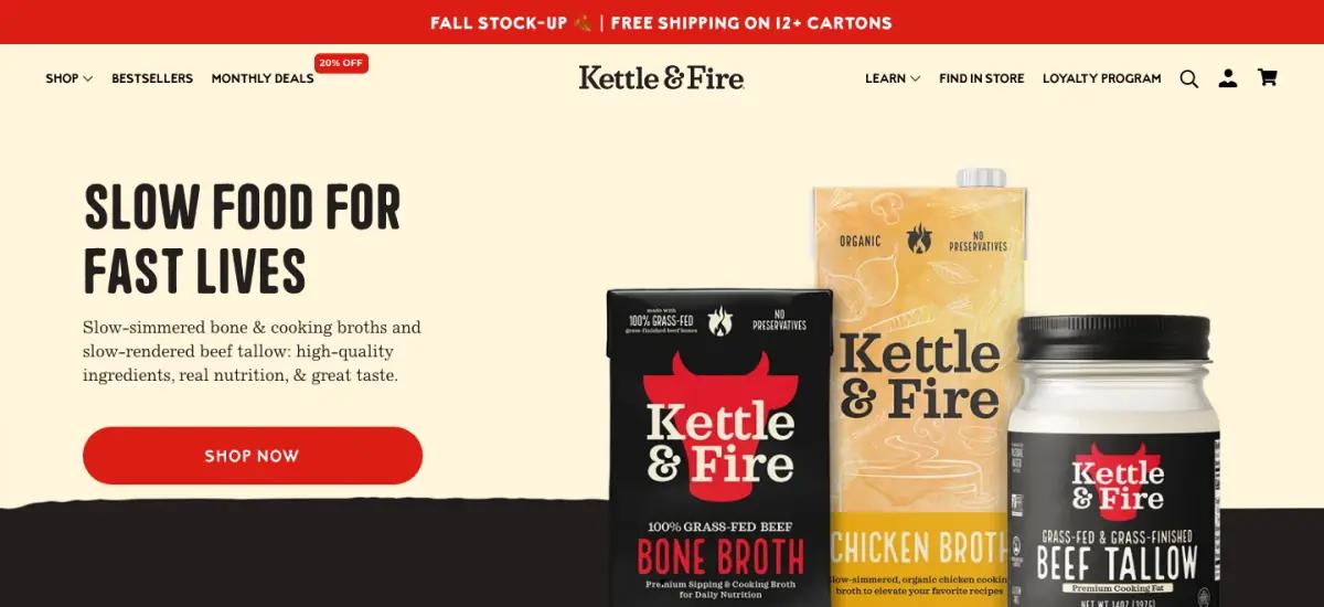
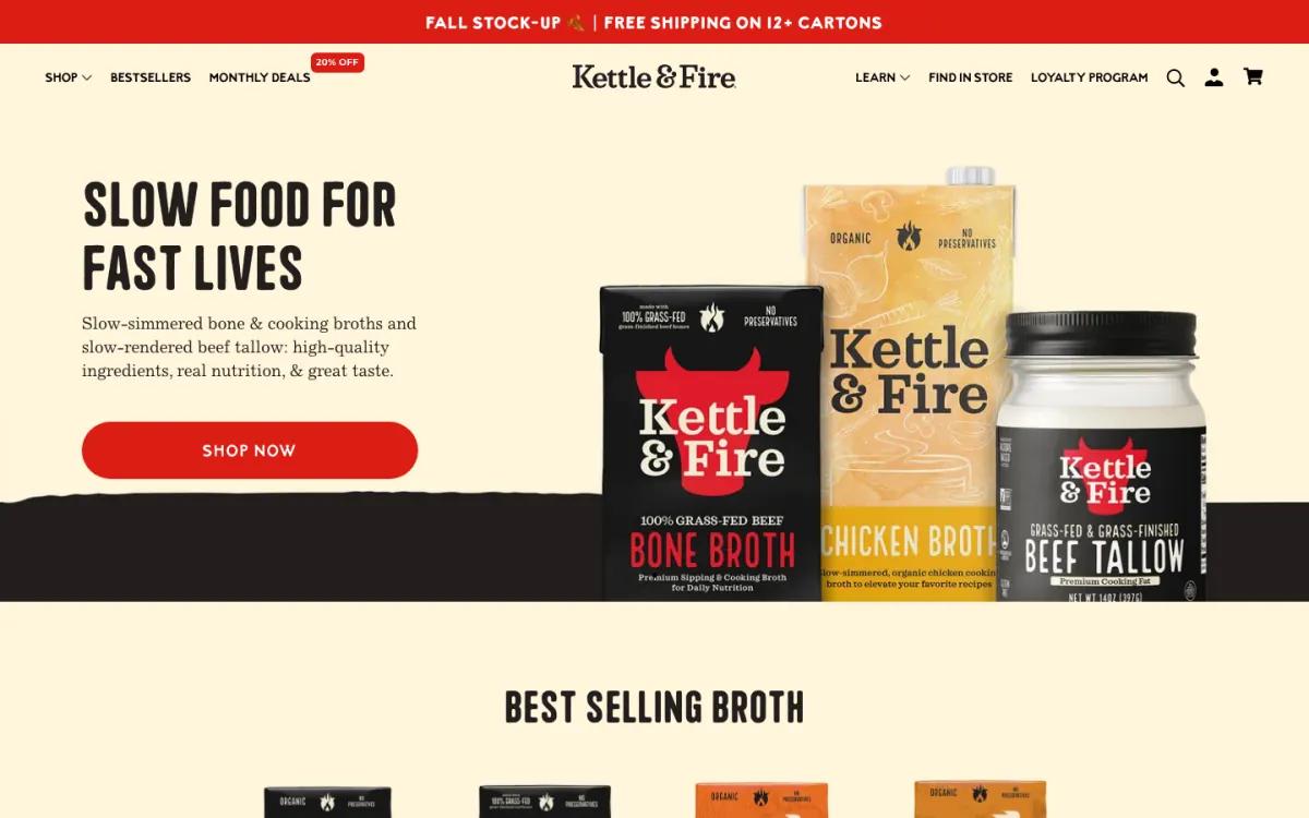
A red bar above the menu announced a fall stock-up with free shipping on 12 or more cartons. The hero is cream, with "Slow Food For Fast Lives" in a tall condensed face.
One sentence covers slow-simmered broths and slow-rendered beef tallow. One red button says "Shop now." The right side shows three products at shelf scale.
The slogan is the best line on the page. It names the tension the product solves in four words.
2Best sellers with review counts in screen two
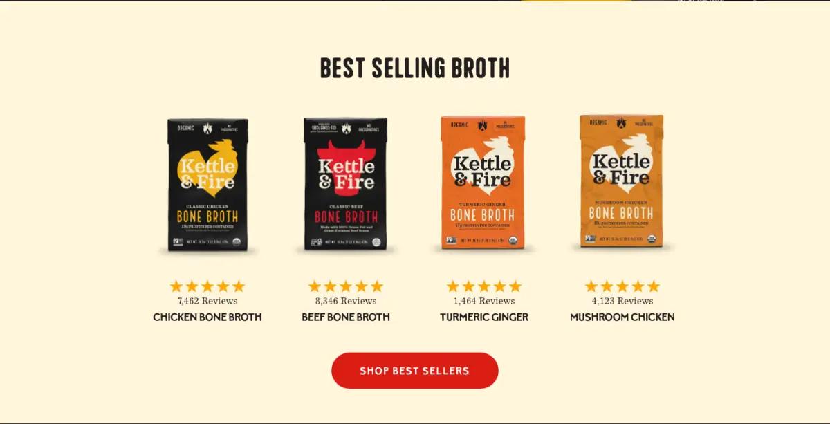
"Best Selling Broth" shows four cartons, each with five stars and a review count:
- Chicken Bone Broth: 7,462 reviews
- Beef Bone Broth: 8,346 reviews
- Turmeric Ginger: 1,464 reviews
- Mushroom Chicken: 4,123 reviews
The cartons are shot straight on with no props. Packaging color carries the range: black for classic, orange for flavored. A visitor from an ad decides here, and it lands in the second screen.
3Five benefit badges in the brand's own shape
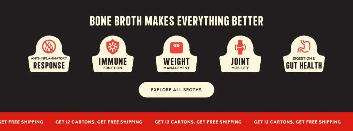
Next, "Bone Broth Makes Everything Better" shows five cream badges on a dark band. They cover inflammation response, immune function, weight management, joint mobility and gut health.
The badge shape echoes the logo, which makes a generic benefits row feel owned. A red ticker follows: "Get 12 cartons, get free shipping."
4Subscribe and save, framed as never running out
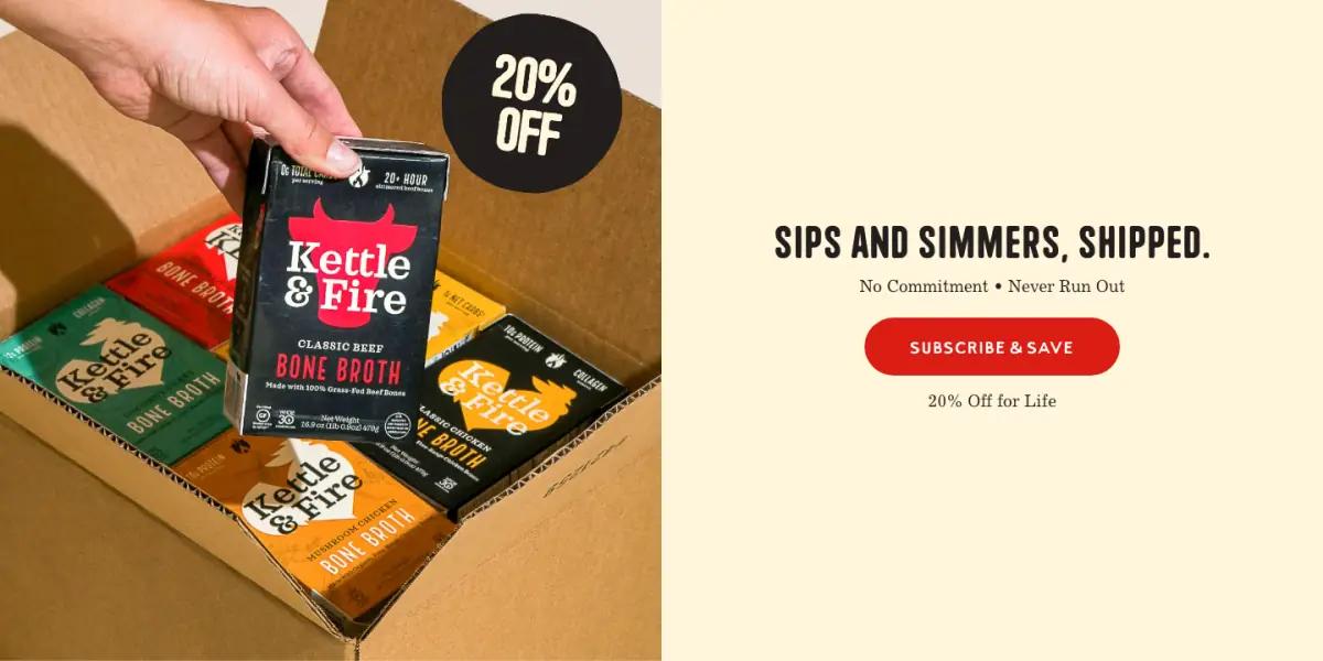
Half the band is a photo of a hand packing cartons into a box, with a "20% off" sticker. The other half reads "Sips and simmers, shipped." and "No Commitment • Never Run Out."
"Never run out" sells a pantry subscription better than a discount alone. It names the real benefit. Putting "No commitment" first answers the main worry before the button. Magic Spoon puts its cancel terms in the offer too.
5A big number and verified-buyer quotes
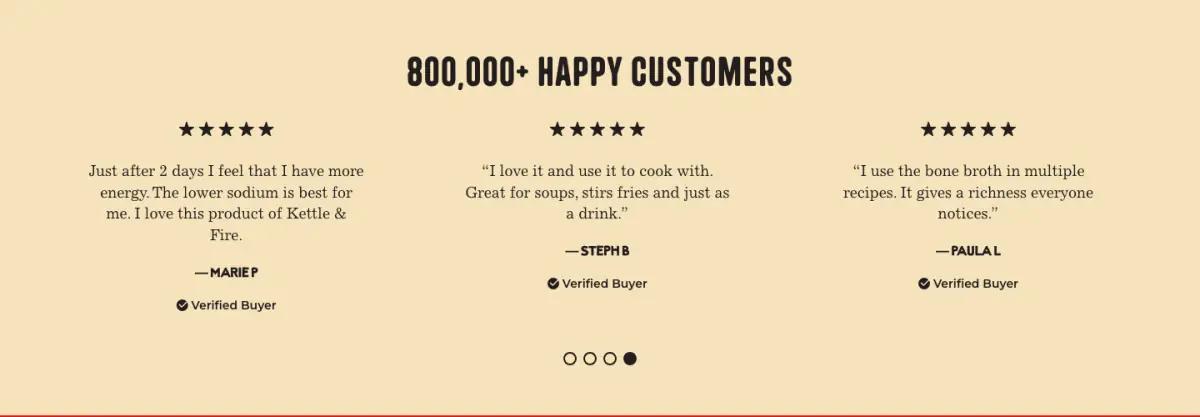
"800,000+ Happy Customers" sits over a carousel of short reviews. Each has five stars, a first name and a Verified Buyer check.
The quotes are practical: broth in soups, stews and gravy, or drunk on its own. Reviews about cooking support the habit story better than reviews about feelings.
6A mission statement as three checkmarks
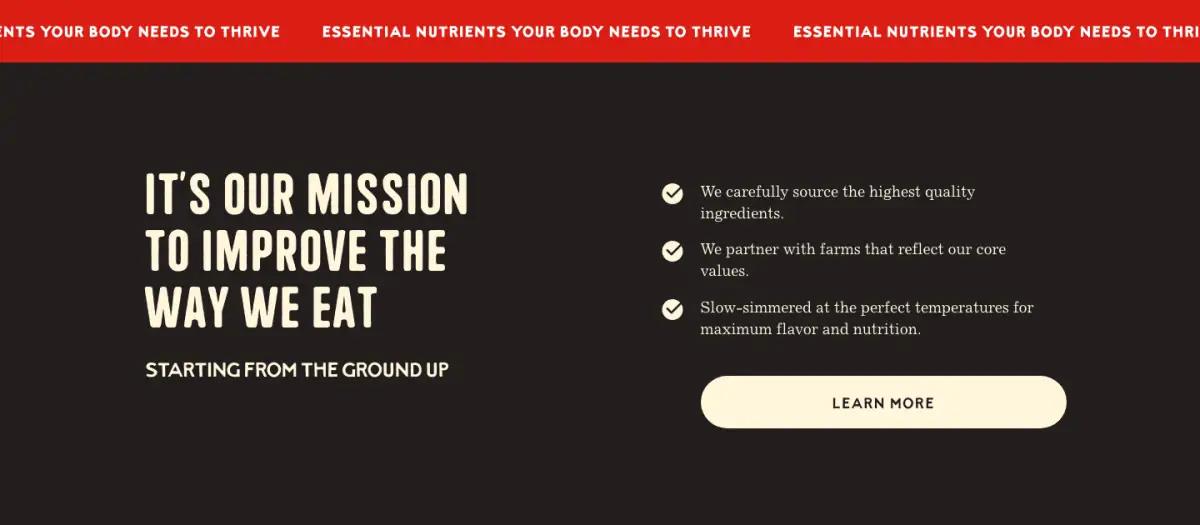
A second ticker leads into a dark band: "It's our mission to improve the way we eat." Three checked lines cover sourcing, farm partners and slow simmering.
A "Learn more" button sends you to the brand story. The mission gets one band, not a page.
7A second offer, kept visually quiet
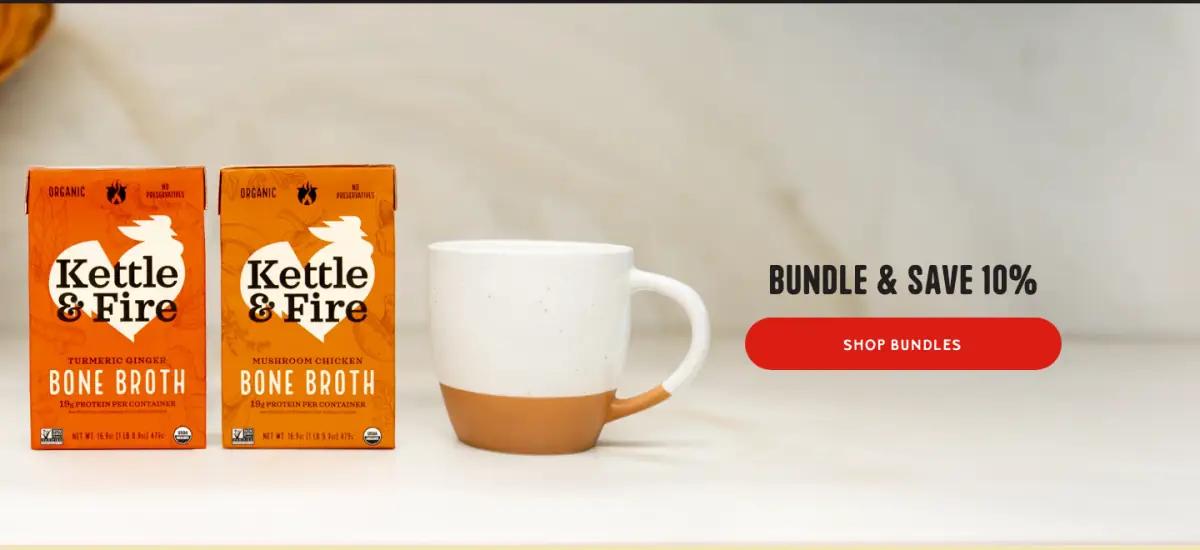
A wide photo of two cartons beside a mug carries "Bundle & Save 10%" and a red button. It gives non-subscribers their own volume deal.
The mug is a nice touch. It shows broth as something you drink, not only cook with.
8Recipe cards in the headline face
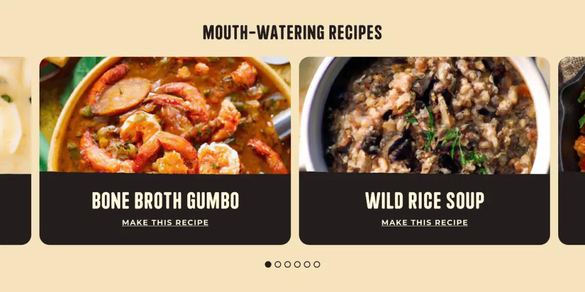
"Mouth-Watering Recipes" is a carousel of wide photo cards, such as Bone Broth Gumbo and Wild Rice Soup. Each has a "Make this recipe" link.
Setting recipe names in the headline face keeps editorial content looking like part of the store.
9Creator videos that link to one product each
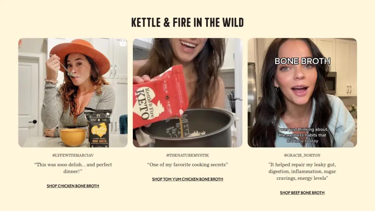
"Kettle & Fire in the Wild" shows three creator clips. Each has an Instagram handle, a short quote and a link to the exact broth in the video.
One product per video is the right call. It respects the visitor who was convinced by a single clip.
10Retail logos as a closing trust signal
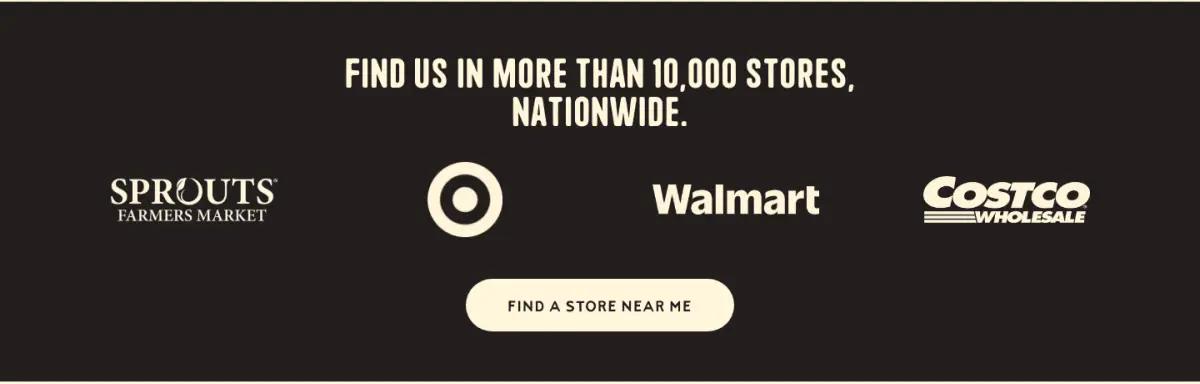
A dark band shows Sprouts, Target, Walmart and Costco logos under "Find us in more than 10,000 stores, nationwide." A store finder button sits below.
Sending shoppers to a store may seem odd on a DTC page. For a pantry staple, it is strong proof the product is mainstream. More examples live in our social proof section gallery.
11A coupon form, then a tidy five-column footer
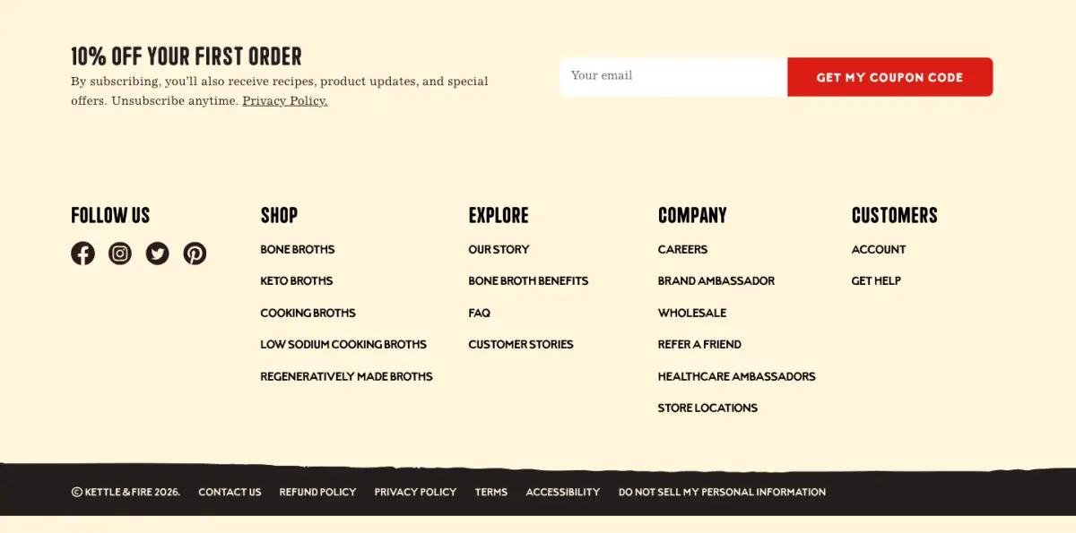
The last offer is an email form: "10% off your first order," with a red "Get my coupon code" button.
Five small-caps columns follow. The Shop column lists broths by type, including keto and low sodium, which doubles as a category map.
What would we change on the Kettle & Fire landing page?
The page carries four volume deals at once: free shipping on 12 cartons, 20% off for life on subscription, 10% off bundles and 10% off a first order by email. Each is reasonable. Together they make shoppers do math.
We would lead with one and move the rest into the cart. Two tickers and two dark brand bands also make the middle feel repetitive.
How does the Kettle & Fire landing page look on a phone?
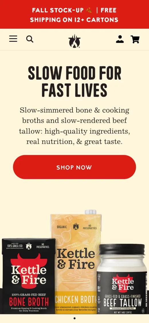
On a phone the headline and red button stack above the product photo, so the call to action comes before the cartons. The condensed headline face holds up well at small sizes.
Captured at 390 × 844, first screen
Which fonts and colors does Kettle & Fire use?
We read these from the live page's styles on the capture date. Hex values are the most-used background and text colors.
Typefaces
Palette
- Cream#FFF5DB
- Kettle black#221E1E
- Fire red#DB1E14
- Toasted cream#F5E3BC
- White#FFFFFF
How would you rebuild a layout like this?
Most of this page is repeatable blocks: a split hero, a four-up product row with ratings, a split offer band, a carousel and a logo wall. Build those five as reusable sections and you have most of it. Keep the condensed headlines as real text so they can change with each promotion.
Any modern page tool can produce this structure. On Shopify, theme sections cover the basics. Builders such as Replo, Shogun or PageFly add finer layout control, and teams with developers often build it in Next.js.
Whatever the tool, make each band a reusable section with editable text. Then a new promotion is a copy change, not a redesign.
Kettle & Fire landing page FAQ
What subscription offer does Kettle & Fire show?
Subscribe and save at 20% off for life, framed as "No commitment, never run out." The page also shows free shipping on 12+ cartons, 10% off bundles and 10% off a first order by email.
Where else can you buy Kettle & Fire?
The homepage says its broths are in more than 10,000 stores nationwide. It shows Sprouts, Target, Walmart and Costco logos and a store finder button.
What fonts does the Kettle & Fire website use?
At capture time, the Kettle & Fire homepage used Coastal (condensed display headlines), Excelsior (body copy and review quotes), Sanremo (labels and buttons), Montserrat (small UI text). We read these from the live page's styles.
How long is the Kettle & Fire landing page?
About 7,100 pixels tall at 1440 pixels wide, or roughly 8 desktop screens. We split it into 11 sections.