Jones Road landing page example: a beauty homepage with a founder's restraint
The Jones Road landing page runs a large holiday sale while keeping a calm, editorial look: white space, black buttons and one red sticker. Tabbed category cards keep shopping compact. A founder quote and magazine logos carry the trust. It is a strong model for beauty brands that discount without losing tone.
By The Teardown Desk · Updated · 4 min read
Beauty brands live on their founders and their press. Jones Road has a strong version of both, and its homepage uses them sparingly.
At capture time the page was mid-way through a holiday sale. The interesting question is how it runs a promotion without changing its tone.
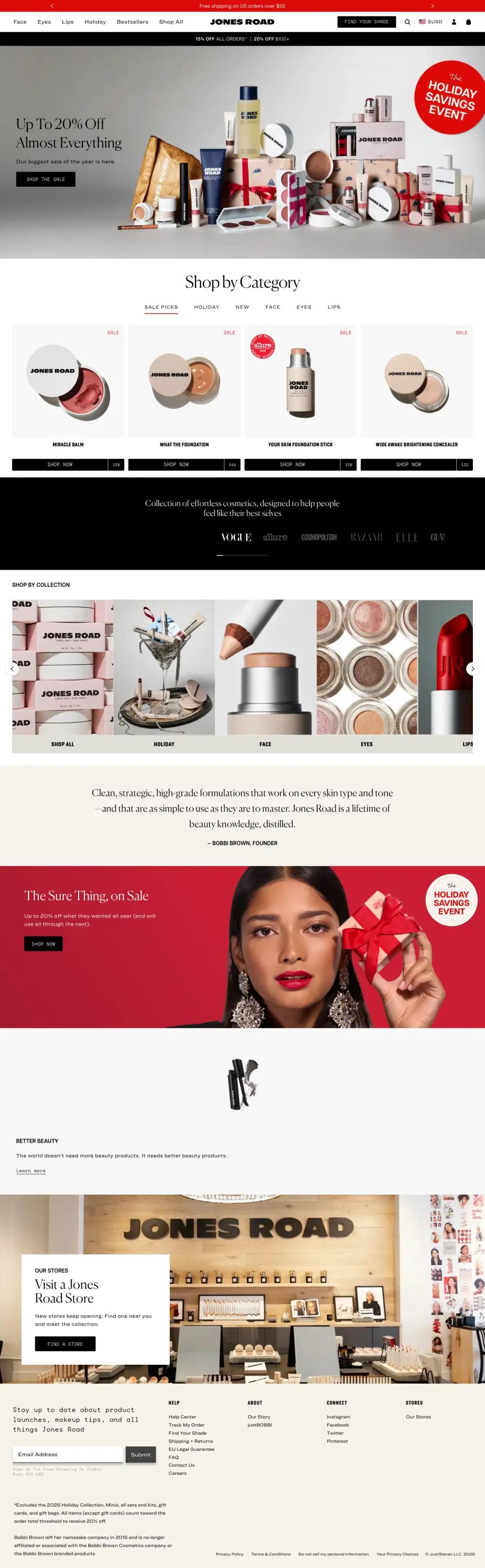
The page runs about 4,600 pixels at desktop width. It is mostly white, with one black band, one cream band and one red one, so each of those moments counts.
What is on the Jones Road landing page?
The page breaks into 9 sections. Each row links to its note below, and the numbers match the pins on the full-page screenshot.
| # | Section | What it does |
|---|---|---|
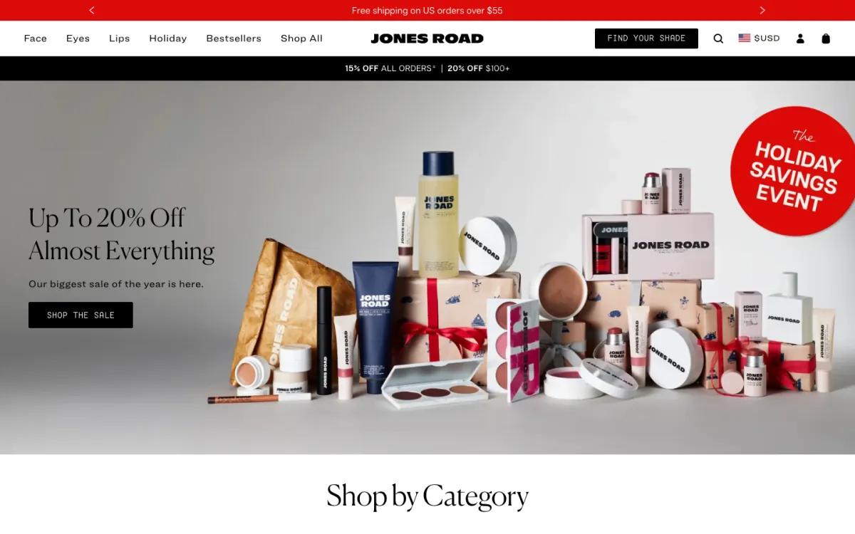
| 1 | Hero | "Up To 20% Off Almost Everything" beside a styled pile of products and gift boxes, with a red sticker. |
| 2 | Categories | Tabs for sale picks, holiday, new, face, eyes and lips over four product cards with 'Shop now | price' bars. |
| 3 | Social proof | One line about effortless cosmetics over a row of magazine logos including Vogue, Allure and Elle. |
| 4 | Collections | Square photo tiles for shop all, holiday, face, eyes and lips in a sideways carousel. |
| 5 | Founder | A cream band with a two-sentence quote credited to Bobbi Brown, founder. |
| 6 | Offer | "The Sure Thing, on Sale" on red, with a portrait holding a wrapped gift. |
| 7 | Pillars | Better beauty, clean slate, high performance and from Bobbi, each a short line with a small image. |
| 8 | Stores | "Visit a Jones Road Store" on a white card over a photo of a store interior. |
| 9 | Footer | A sign-up line set in a wide mono face, four link columns and the sale's fine print. |
How does the Jones Road landing page work, section by section?
1A sale hero that still looks like a still life
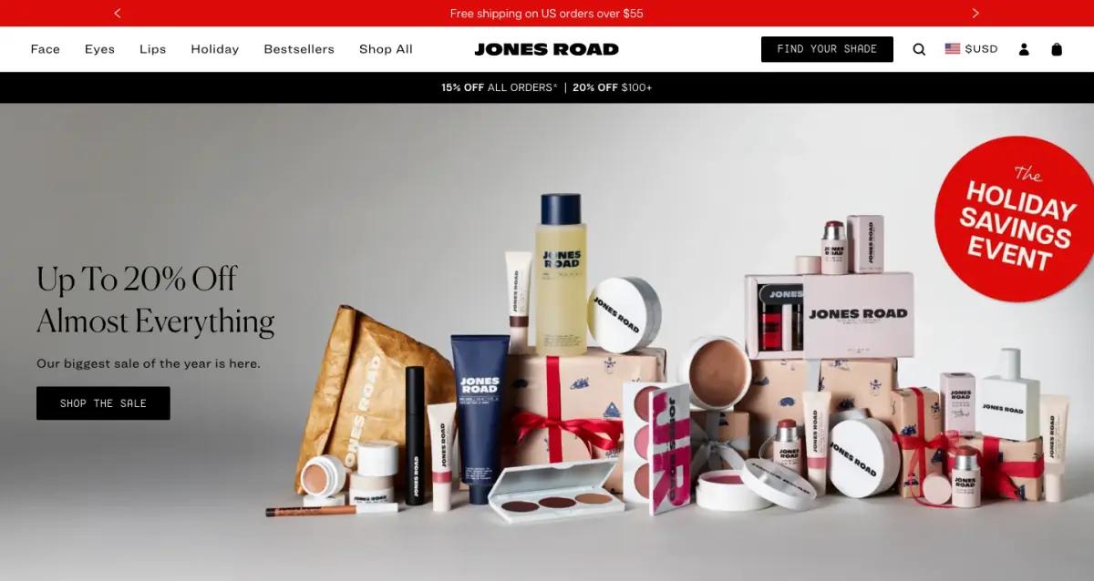
Three bars stack above the hero: shipping, the menu, and a black discount bar. The menu includes a black "Find your shade" button.
The hero reads "Up To 20% Off Almost Everything," with a black "Shop the sale" button. The image is a styled still life of products and wrapped boxes on grey.
The only loud element is a red round sticker: "The Holiday Savings Event." The sale is clear, yet the hero still looks like the brand.
2Tabbed categories with the price on the button
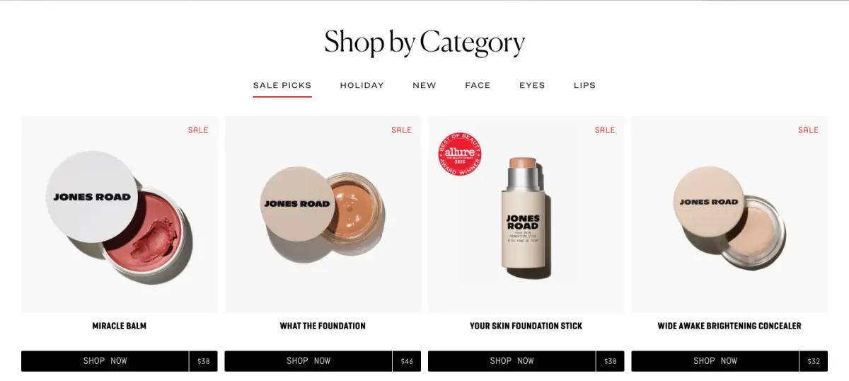
"Shop by Category" uses text tabs with an underline for the active one: Sale picks, Holiday, New, Face, Eyes, Lips. Tabs let six categories share one row.
Four cards sit below on light grey, including Miracle Balm and What The Foundation. Each has a red "Sale" label and a black bar that splits "Shop now" from the price.
The product names are written in the brand's chatty voice. They do some selling before you read a word of description.
3Magazine logos on black

A black band carries one sentence about effortless cosmetics. Below it runs a row of grey magazine logos, including Vogue, Allure, Cosmopolitan, Harper's Bazaar and Elle.
It is a standard press bar, kept small. Greying the logos keeps them from competing with the products. See more beauty and skincare landing page examples.
4Collections as big image tiles
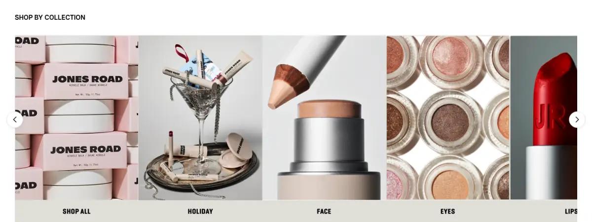
"Shop by collection" is a carousel of large square photos: stacked tins, a cocktail-glass arrangement, a pencil, eyeshadow pans, a red lipstick.
The close-up photography gives plain shopping links an editorial feel.
5One founder quote, set large
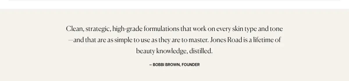
A cream band holds a two-sentence quote about formulas that work on every skin type, credited to "Bobbi Brown, Founder." There is no photo and no story block.
For a founder this well known, the name is the proof. The footer adds that she left her namesake company in 2016 and is not tied to it, which shows how much the brand relies on her name.
6The sale, rewritten as a gift message
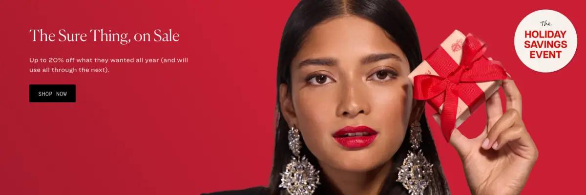
The only red section reads "The Sure Thing, on Sale," with up to 20% off "what they wanted all year." A portrait on the right holds a wrapped gift.
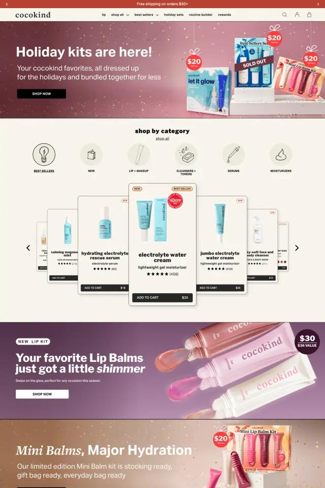
This is the hero offer rewritten for gift shoppers: same discount, different reader. Saving the loudest color for one band keeps the sale from taking over. Cocokind's holiday homepage goes the other way.
7Brand pillars in a slow carousel
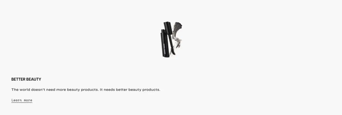
A white section steps through four short pillars, each with a small image and a "Learn more" link:
- Better beauty: "The world doesn't need more beauty products. It needs better beauty products."
- Clean slate: a list of ingredients the brand leaves out
- High performance: easy, multi-purpose products
- From Bobbi: formulas that began in the founder's own kit
8A store finder over a shop photo
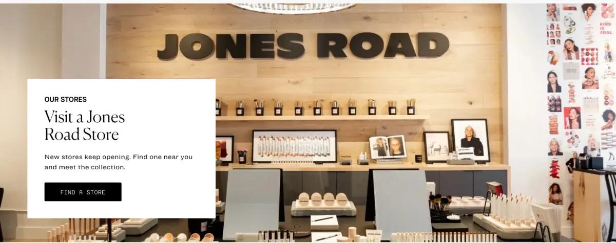
A white card floats over a photo of a store: "Visit a Jones Road Store. New stores keep opening."
For makeup, trying a shade in person matters, so a store finder is a fair path. It also signals scale.
9A mono-set sign-up and fine print
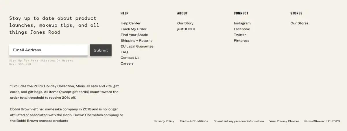
The footer sign-up line is set in a wide monospace face. Four short link columns follow.
The fine print lists what the sale excludes, which is exactly where a careful shopper would look.
What would we change on the Jones Road landing page?
Three bars stack above the hero. On a laptop that pushes the photo down. Folding the discount line into the hero copy would give the image room.
The pillars sit in a carousel, so most visitors see only the first. A four-column row would take the same height and show everything.
How does the Jones Road landing page look on a phone?
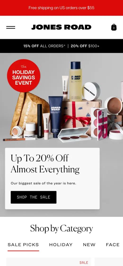
On a phone the red sticker moves to the top-left of the photo. The headline and button sit on a white card that overlaps the image, and the black discount bar stays under the header.
Captured at 390 × 844, first screen
Which fonts and colors does Jones Road use?
We read these from the live page's styles on the capture date. Hex values are the most-used background and text colors.
Typefaces
Palette
- White#FFFFFF
- Black#000000
- Cream#F6F2EB
- Sale red#DB0B09
- Stone#E0DED8
Jones Road landing page FAQ
What is the Find your shade button on Jones Road?
A permanent black button in the header for finding a foundation shade. It keeps the biggest worry about buying makeup online in view on every screen.
How does Jones Road show a sale on its homepage?
With a sale headline in the hero, a black discount bar, one red sticker and one red gift band. The rest of the page stays white and black.
What fonts does the Jones Road website use?
At capture time, the Jones Road homepage used Canela (display headlines and the founder quote), Articulat CF (body copy), Ringside Wide (product names and labels), Base Mono Wide (footer sign-up and buttons). We read these from the live page's styles.
How long is the Jones Road landing page?
About 4,600 pixels tall at 1440 pixels wide, or roughly 5 desktop screens. We split it into 9 sections.