Graza landing page example: an olive oil homepage built on character
The Graza landing page sells personality first and products second. It opens on food, explains freshness with drawings, then shows three bottles, each named for its job: Drizzle, Sizzle and Frizzle. It is a strong model for any brand selling one familiar ingredient on a crowded shelf.
By The Teardown Desk · Updated · 4 min read
Olive oil is a crowded shelf. Most bottles compete on region, acidity and the word "premium."
Graza's homepage barely uses that vocabulary. It leans on a voice, a set of drawings and a product line you can understand at a glance.
We captured the page at 1440 pixels wide. It runs about 8,700 pixels, which is long for three products. Rhythm keeps it moving: every band changes color, scale or format.

What is on the Graza landing page?
The page breaks into 8 sections. Each row links to its note below, and the numbers match the pins on the full-page screenshot.
| # | Section | What it does |
|---|---|---|
| 1 | Hero | A full-bleed shot of something frying in oil, one line of copy and a chartreuse pill button. |
| 2 | Offer | A thin strip names the current olive origin and harvest season, followed by a carousel for new launches. |
| 3 | Story | Line drawings of olives and a picker carry the 'fresh is best' argument in a few dozen words. |
| 4 | Products | A giant wordmark introduces three product cards, each labeled with flavor, size and a one-line use. |
| 5 | Interlude | A rotating set of olive facts, including that one bottle of Drizzle takes about 5,000 olives. |
| 6 | Recipes | Seven cooking verbs in a loose layout beside a single featured recipe photo. |
| 7 | About | A photo of olives on the branch with "Made by people who take olives very seriously." |
| 8 | Footer | A rounded-photo social row, a typewriter sign-up and a wordmark that fills the footer. |
How does the Graza landing page work, section by section?
1Food, not bottles, above the fold
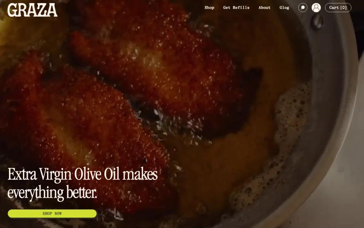
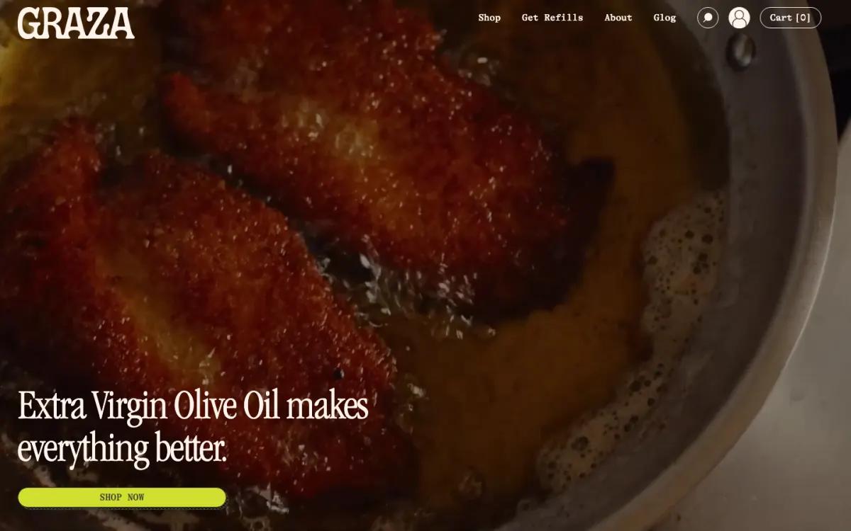
The first screen is a full-bleed photo of food frying in a pan. One sentence sits over it: "Extra Virgin Olive Oil makes everything better."
There is no bottle in the frame. The only brand color is the chartreuse "Shop now" pill, which matches the Drizzle label further down.
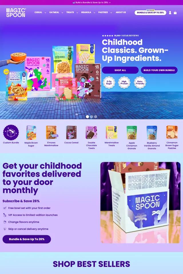
Leading with the result is a confident move for a brand known for its packaging. It tells you what the oil is for before showing what it looks like. Compare it with other ecommerce hero section examples.
2A sourcing strip, then a launch carousel
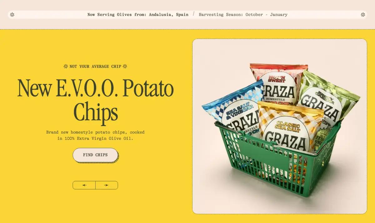
Right under the hero sits a thin strip that reads like a menu board. It names where the olives come from right now and the harvest season, October to January.
It is a small detail. But provenance is the first thing a skeptical olive oil buyer looks for, and here nobody can miss it.
Next comes a yellow carousel for launches. At capture time the first slide was "New E.V.O.O. Potato Chips." Other slides covered The Trio set and Graza in glass.
New products live here, not in the hero. That keeps the top of the page stable while promotions rotate.
3Freshness explained with drawings
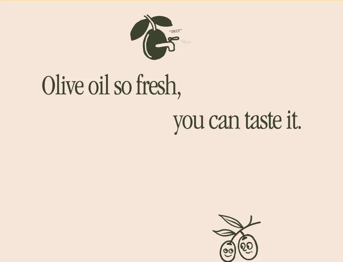
"Olive oil so fresh, you can taste it." is set huge, staggered across two lines. Line drawings follow: a winking olive, two smiling olives on a branch, a farmer with a basket.
Each drawing gets a short typewriter caption, like "Happy olives, happy oil" and "Fresh is best." This is the brand argument, and it costs almost no reading.
It is also the slowest stretch of the page: close to 1,900 pixels with very little text. If we were editing, we would shorten this band first.
4Three bottles, three jobs
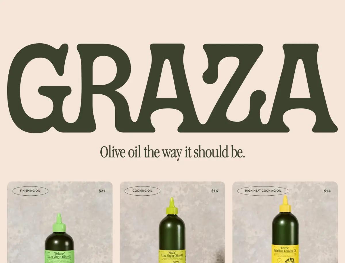
A wordmark as wide as the screen introduces the line "Olive oil the way it should be." Three product cards follow.
This is the best block on the page. The names do the selling: you know which bottle you need from the name alone. A flavor word answers the next question.
| Product | Use | Flavor | Size | Price |
|---|---|---|---|---|
| Drizzle | Finishing oil | Punchy | 500 ml | $21 |
| Sizzle | Cooking oil | Mellow | 750 ml | $16 |
| Frizzle | High heat cooking oil | Neutral | 750 ml | $14 |
5A fun-fact carousel as a palate cleanser
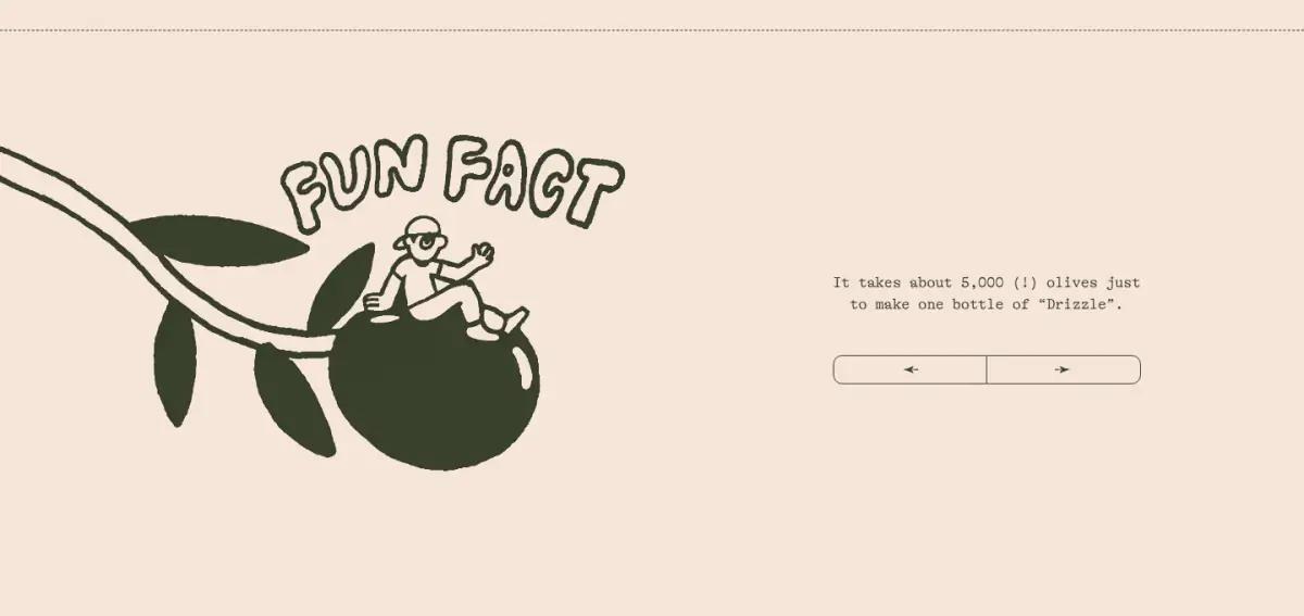
An illustrated olive branch with "Fun Fact" lettering sits beside a small carousel. One fact: it takes about 5,000 olives to make one bottle of Drizzle.
It does not help anyone decide on its own. But it makes the brand feel human, and the 5,000 olives reframe a $21 price.
6Verbs instead of recipe cards
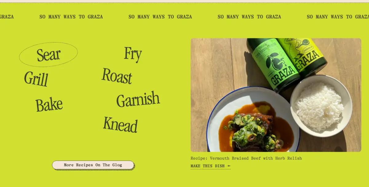
"So many ways to Graza" runs as a ticker. Then seven verbs are scattered across a chartreuse field: Sear, Fry, Grill, Roast, Bake, Garnish, Knead.
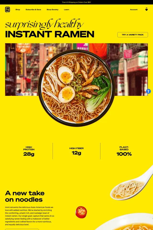
One recipe photo sits beside them, with a button to the blog Graza calls the Glog. Most food brands put three recipe cards here, as immi does near its footer.
The verb cloud is more memorable. It still does the real job of a recipe section: it reminds you how often you would use the product.
7An origin story in one sentence
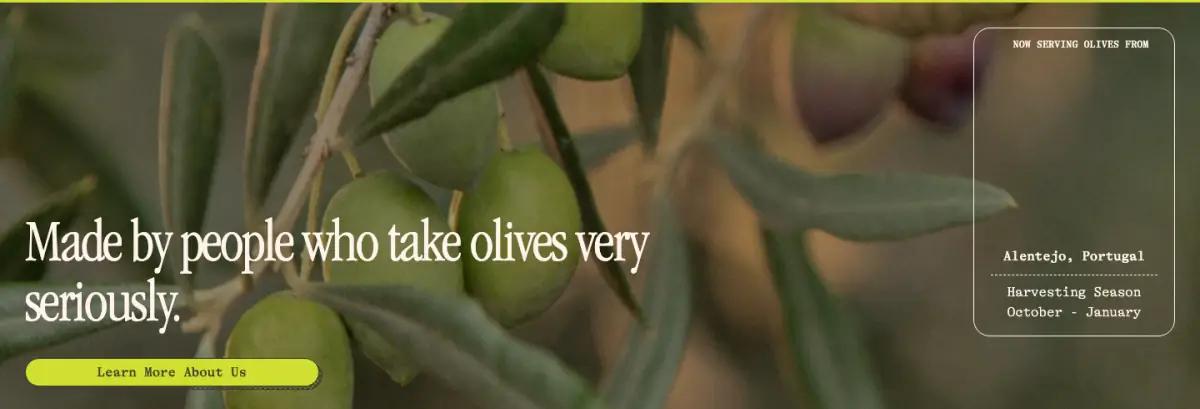
A photo of olives on the tree carries one line: "Made by people who take olives very seriously." A see-through card in the corner repeats the origin and harvest season.
The page trusts one sentence and a link to do the work of a founder story.
8A photo row and a wordmark as wide as the page
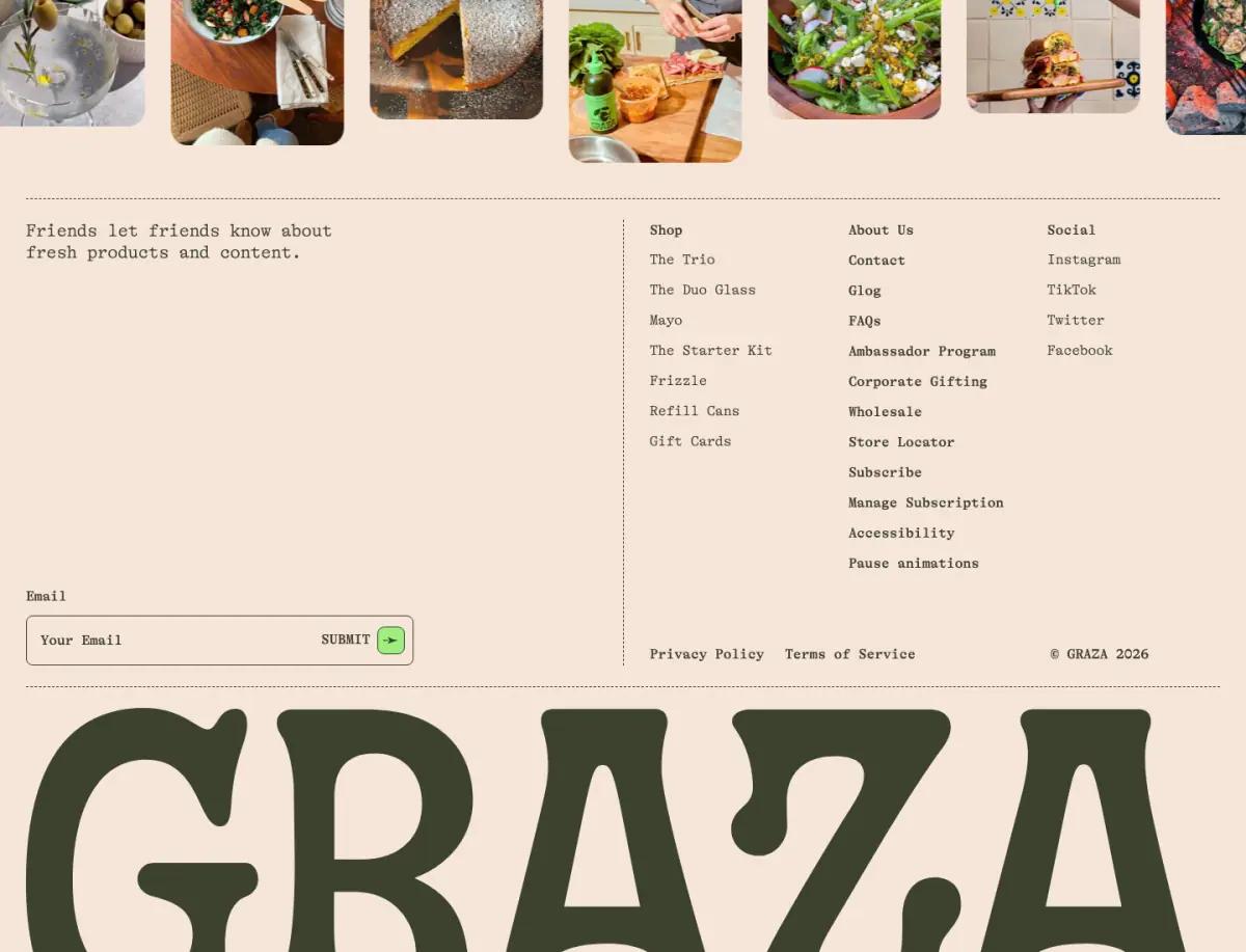
"See what else we're cooking up" introduces a row of rounded food photos linked to social.
The footer is calm: an email field, three link columns, then the GRAZA wordmark again, cropped by the bottom edge. Ending on the wordmark gives the page a clear floor.
What would we change on the Graza landing page?
The first product card sits about 4,400 pixels down on desktop. A small three-bottle row near the top would help shoppers who arrive from an ad already knowing what they want.
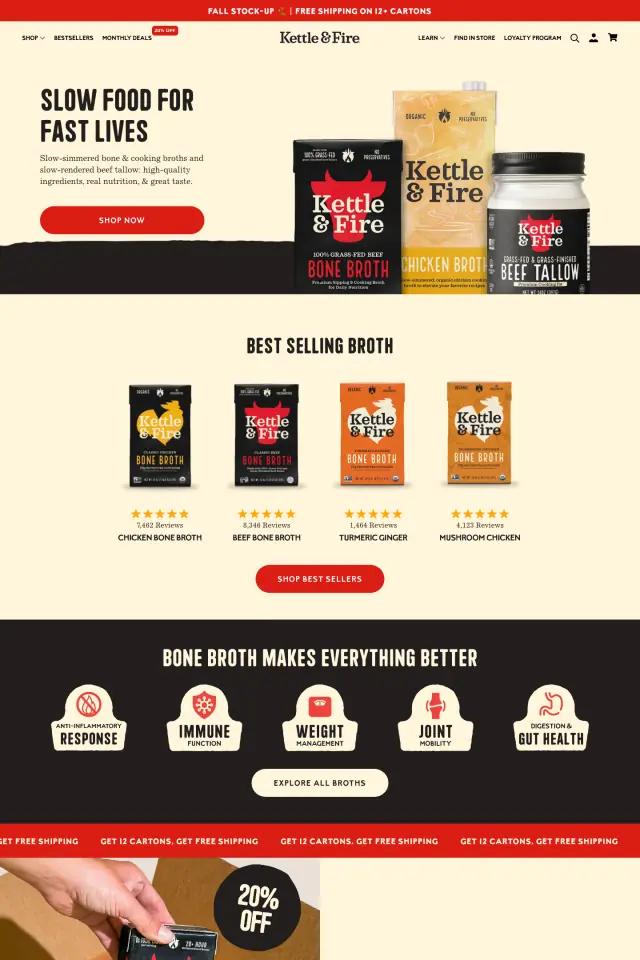
The homepage shows no reviews or ratings. That may be a choice, but one line of proof near the product cards would cost little. See how Kettle & Fire's best seller row adds ratings.
How does the Graza landing page look on a phone?
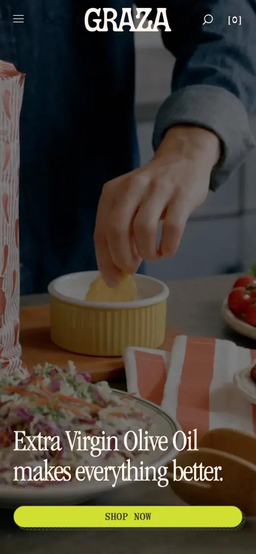
On a phone the hero becomes a tall video frame. The headline sits on two lines, and a full-width chartreuse button lands at the bottom of the first screen, within thumb reach.
Captured at 390 × 844, first screen
Which fonts and colors does Graza use?
We read these from the live page's styles on the capture date. Hex values are the most-used background and text colors.
Typefaces
Palette
- Peach paper#F6E6D9
- Olive ink#3C422E
- Chartreuse#D1E030
- Carousel yellow#FBD535
- Leaf green#9EEF80
How would you rebuild a layout like this?
The structure is simple: a full-bleed media hero, a two-column carousel, a three-up product grid and a few single-message bands. The hard part is type. The wordmark and the staggered headline only work as live text that scales with the screen, not as images.
Any modern page tool can produce this structure. On Shopify, theme sections cover the basics. Builders such as Replo, Shogun or PageFly add finer layout control, and teams with developers often build it in Next.js.
Whatever the tool, make each band a reusable section with editable text. Then a new promotion is a copy change, not a redesign.
Graza landing page FAQ
Does the Graza homepage show customer reviews?
No. At capture time the homepage had no star ratings or review quotes. It relied on product names, drawings and sourcing details instead.
What are Graza's three olive oils?
Drizzle is a punchy finishing oil ($21, 500 ml). Sizzle is a mellow everyday cooking oil ($16, 750 ml). Frizzle is a neutral high heat oil ($14, 750 ml). Prices are as shown at capture time.
What fonts does the Graza website use?
At capture time, the Graza homepage used GT Alpina Typewriter (body copy, labels and navigation), ITC Garamond Condensed (display headlines), Apercu (small UI details). We read these from the live page's styles.
How long is the Graza landing page?
About 8,700 pixels tall at 1440 pixels wide, or roughly 10 desktop screens. We split it into 8 sections.