Graza
Olive oil · Homepage
Food & drink · Added Nov 18, 2026
The best food and drink landing pages show the food before the package, put a bundle or subscription offer in the first few screens, and prove taste with reviews tied to specific products. These four teardowns show how Graza, Magic Spoon, Kettle & Fire and immi each do it.
Food is bought again and again, so these pages are built for the second order as much as the first.
Each teardown below has a full-page screenshot captured at 1440 pixels wide, with notes pinned to every section.
By The Teardown Desk · Updated Nov 19, 2026
Page length is measured on a 1440 pixel wide capture. The last column names the one idea we would copy from each page.
| Page | Category | Length | Sections | Worth copying |
|---|---|---|---|---|
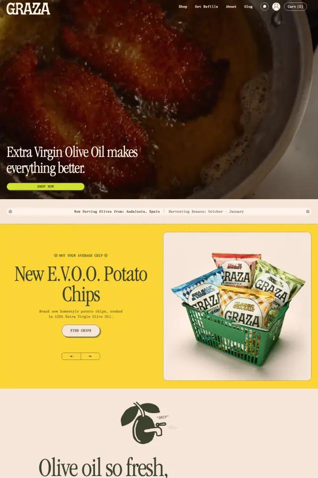
| Graza | Olive oil | 8,699 px | 8 | Name products by their job |
| Magic Spoon | Cereal | 6,995 px | 9 | Put the cancel terms in the offer |
| Kettle & Fire | Bone broth | 7,143 px | 11 | Describe what subscribing feels like |
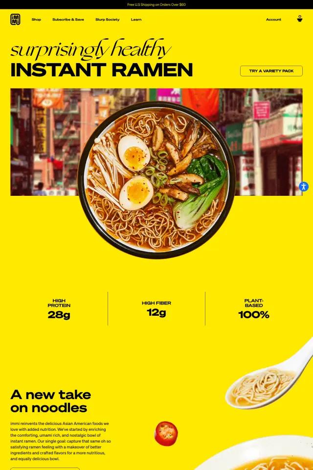
| immi | Instant ramen | 9,583 px | 10 | Put your numbers under the hero |
Graza opens on oil in a hot pan. immi opens on a bowl of ramen. The package comes later.
Magic Spoon's best sellers are all bundles. Kettle & Fire offers free shipping on 12 cartons and subscribe and save.
Customer and creator videos link to the exact product in the clip, not to a collection page.
A verb cloud, a carousel or three cards. Recipes remind you how often you would use the product, then get out of the way.
Compare one section across every page, or switch industries.
Appetizing photos of the food in use, a clear first offer, and proof tied to specific products. Nutrition or sourcing facts should sit near the top, set as short lines or numbers.
For products people use daily, it often makes sense. Magic Spoon and Kettle & Fire both show subscription terms within the first few screens, and both state that you can cancel or that there is no commitment.
The four pages here run from about 7,000 to 9,600 pixels at desktop width. Length matters less than rhythm: each band should change format or color so the page keeps moving.