Cocokind landing page example: a skincare homepage in holiday mode
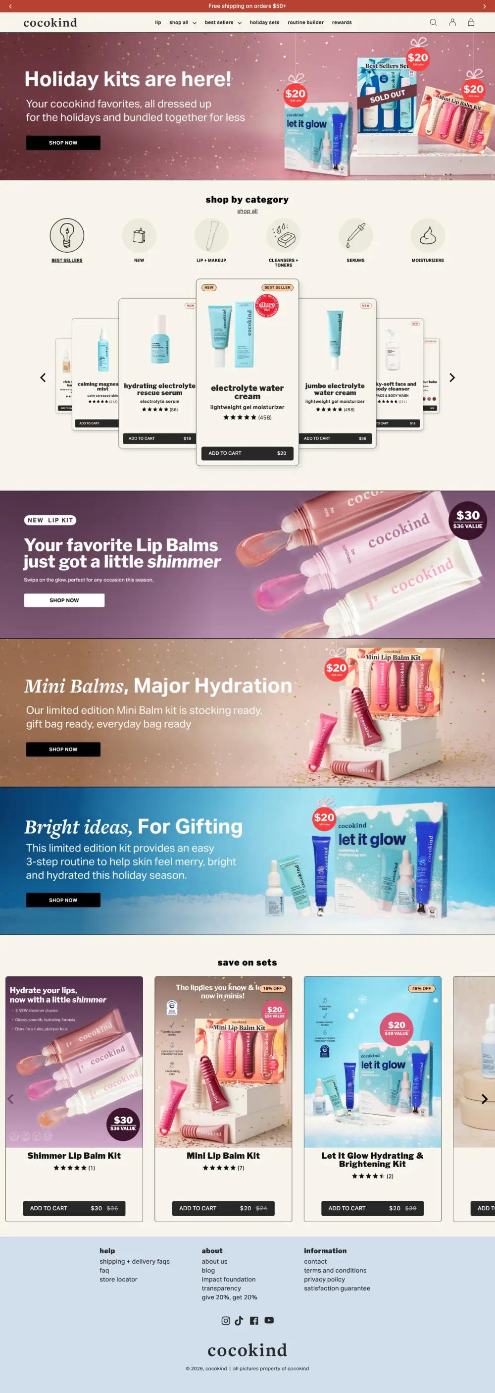
The cocokind landing page is short and almost entirely shoppable. At capture time it ran about 4,000 pixels and put an add-to-cart button on nearly every product it showed. It also shows the cost of a holiday takeover: the brand's core promise, made for sensitive skin, barely appears.
By The Teardown Desk · Updated · 3 min read
Skincare homepages tend to fall into two camps. Some explain ingredients and philosophy. Others get you to a product fast.
Cocokind's homepage, captured in November, is firmly the second kind, and it was dressed for the holidays.
That makes it a good study in seasonal selling. It is the shortest page in our collection, and very little of it is not a product or a promotion.
What is on the cocokind landing page?
The page breaks into 5 sections. Each row links to its note below, and the numbers match the pins on the full-page screenshot.
| # | Section | What it does |
|---|---|---|
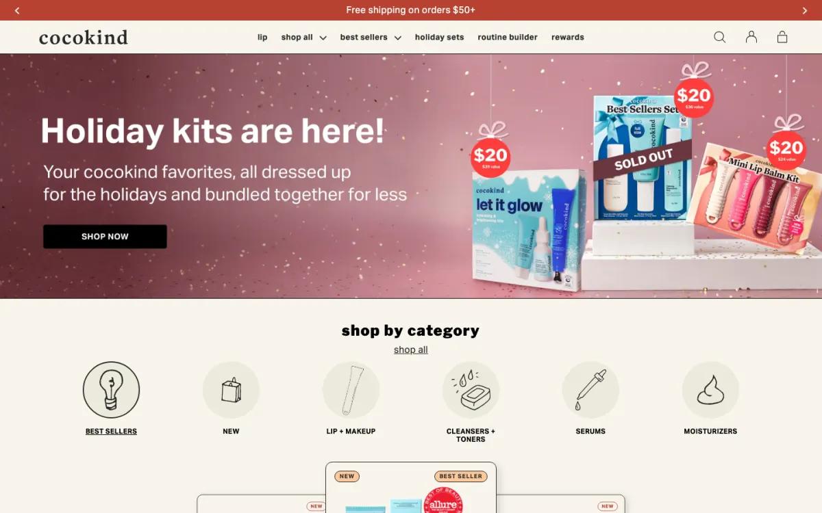
| 1 | Hero | "Holiday kits are here!" over a rose backdrop, with $20 gift tags hanging off each kit. |
| 2 | Categories | Six hand-drawn category icons, then a carousel where the center product card is enlarged. |
| 3 | Promos | Stacked banners for a new shimmer lip kit, a mini balm kit and a gifting kit, each with its own color. |
| 4 | Sets | "save on sets" carousel with kit names, ratings and sale prices beside struck-through originals. |
| 5 | Footer | Help, about and information columns, social icons and the lowercase wordmark, on pale blue. |
How does the cocokind landing page work, section by section?
1Gift kits with price tags in the image
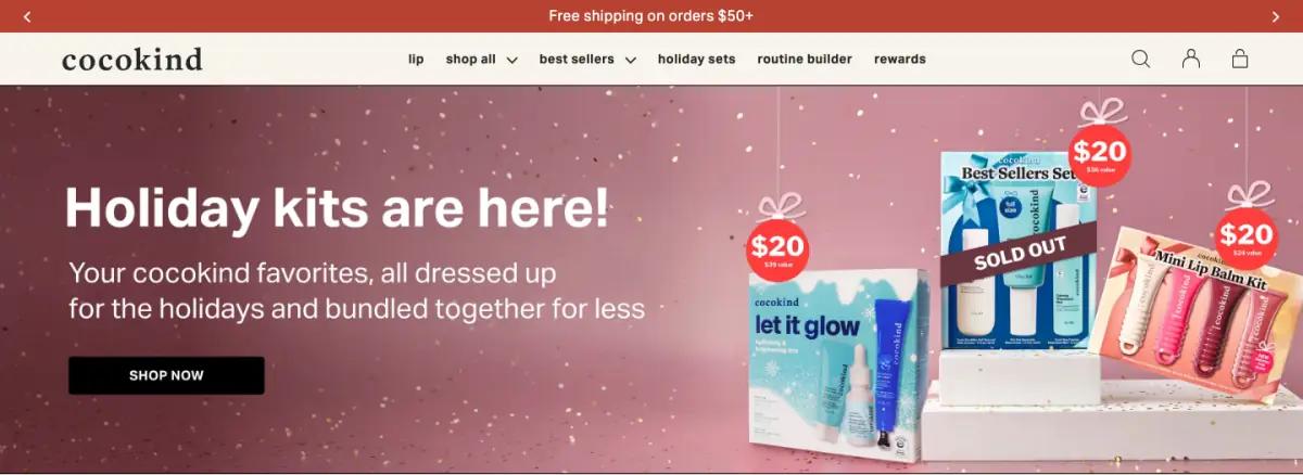
"Holiday kits are here!" sits on a rose-colored photo, with one line about favorites bundled together for less. A black "Shop now" button follows.
On the right, three kits wear red "$20" gift tags on ribbons. One is marked "Sold out."
Above it all, a slim bar promises free shipping on orders over $50. The lowercase wordmark and a short lowercase menu keep the header light: lip, shop all, best sellers, holiday sets, routine builder, rewards.
Putting the price inside the art turns a mood image into an offer, and the sold-out kit adds urgency. Jones Road takes the opposite approach with one quiet sticker.
2Icon categories over a coverflow carousel
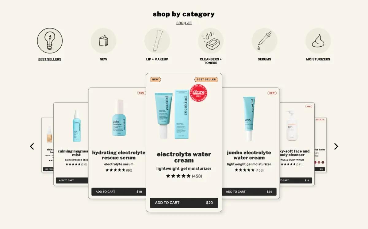
"shop by category" shows six round icons drawn in a loose line style, from best sellers to moisturizers.
Below is a coverflow carousel: the center card is enlarged, and the cards on each side step down in size. At capture time the center card was the electrolyte water cream, with an Allure badge and a $20 add-to-cart bar.
Every card has the same add-to-cart bar. You never need a product page to buy.
The center card stacks three markers: a "new" tag, a "best seller" tag and a red Allure seal. Each helps alone. Together they start to compete for the eye.
3Three full-width promo banners in a row
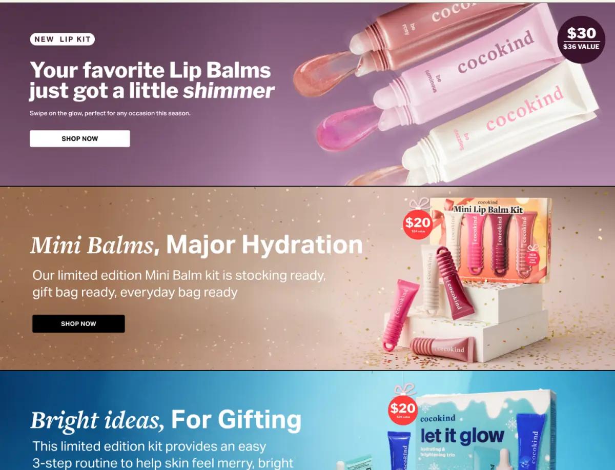
Three wide banners stack one after another. Each has a headline, one sentence and the same black button:
- Mauve: a new shimmer lip balm kit, with a "$30 / $36 value" roundel
- Warm bronze: "Mini Balms, Major Hydration," a limited mini balm kit
- Icy blue: "Bright ideas, For Gifting," a three-step gift kit
A different background for each banner makes three similar offers look distinct. The headlines mix a light italic with a sans-serif, which gives the holiday set a more editorial voice.
4Strike-through prices on every set
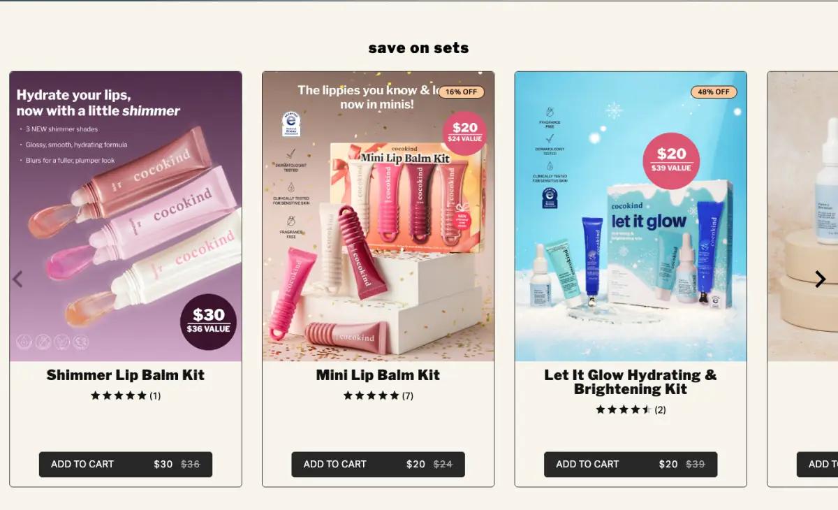
"save on sets" then closes the shopping part with tall kit cards. Each shows a star rating, the sale price and the original price struck through.
Small benefit callouts sit on each card image, which saves a click when comparing sets. This is a well-built block. Browse more offer section examples to compare.
5A pale blue footer with three short columns
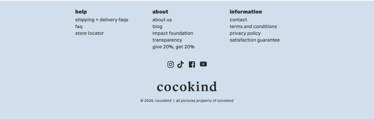
The footer is pale blue, with three short columns, social icons and the lowercase wordmark centered.
The about column links to an impact foundation and a transparency page. That is the closest the homepage comes to the brand's values story.
What would we change on the cocokind landing page?
The page's title tag calls cocokind "powerful results for sensitive skin." Nothing on the visible page said so at capture time. One line about sensitive skin in the hero would keep new visitors oriented.
Three promo banners in a row, each with the same button, blur into one long ad. Two would do; fold the third into the sets carousel. See more beauty and skincare landing page examples.
The routine builder link in the menu may be the most useful tool for a first-time skincare buyer. We would give it a small band of its own, right after the categories.
How does the cocokind landing page look on a phone?
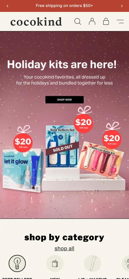
On a phone the hero keeps its headline and button above the kit photo. The category icons become a row that scrolls sideways, and the header stays compact.
Captured at 390 × 844, first screen
Which fonts and colors does cocokind use?
We read these from the live page's styles on the capture date. Hex values are the most-used background and text colors.
Typefaces
Palette
- Oat#F7F4EC
- Soft black#282828
- Footer blue#D0DEEC
- Sand#EBE6D8
- White#FFFFFF
cocokind landing page FAQ
Why is the cocokind homepage so short?
At capture time it was a holiday shopping page: a kit hero, categories, three promo banners, a sets carousel and a footer. That adds up to about 4,000 pixels.
Can you add to cart from the cocokind homepage?
Yes. Every product card in the category carousel and the sets carousel had its own add-to-cart button with a price.
What is in the cocokind homepage menu?
Six short lowercase links at capture time: lip, shop all, best sellers, holiday sets, routine builder and rewards. Shop all and best sellers open larger menus.
What fonts does the cocokind website use?
At capture time, the cocokind homepage used Aktiv Grotesk (body copy, buttons and product names), Libre Franklin (section headings). We read these from the live page's styles.
How long is the cocokind landing page?
About 4,000 pixels tall at 1440 pixels wide, or roughly 4 desktop screens. We split it into 5 sections.